Skip to content
  • Recent
  • Tags
  • Popular
  • Users
  • Search
Skins
  • Light
  • Brite
  • Cerulean
  • Cosmo
  • Flatly
  • Journal
  • Litera
  • Lumen
  • Lux
  • Materia
  • Minty
  • Morph
  • Pulse
  • Sandstone
  • Simplex
  • Sketchy
  • Spacelab
  • United
  • Yeti
  • Zephyr
  • Dark
  • Cyborg
  • Darkly
  • Quartz
  • Slate
  • Solar
  • Superhero
  • Vapor

  • Default (No Skin)
  • No Skin
Collapse

Lay Theme Forum

  1. Home
  2. General Discussion
  3. Centered Textblock

Centered Textblock

Scheduled Pinned Locked Moved General Discussion
13 Posts 3 Posters 1.2k Views 1 Watching
  • Oldest to Newest
  • Newest to Oldest
  • Most Votes
Reply
  • Reply as topic
Log in to reply
This topic has been deleted. Only users with topic management privileges can see it.
  • mariusjopenM
    mariusjopenM
    mariusjopen
    Global Moderator
    wrote on last edited by
    #2

    Dear @edgrbnz
    it looks like it is horizontally centered and has a mx width, no?

    Best!

    Marius

    www.mariusjopen.world

    1 Reply Last reply
    0
    • edgrbnzE
      edgrbnzE
      edgrbnz
      wrote on last edited by edgrbnz
      #3

      Not really…
      It unfortunately sticks to the left above the 1200px max-width.

      So if the site gets viewed on a screen with a common resolution around 1920px in width the text oddly sticks to the left.
      It seems like my class gets overwritten by this one:
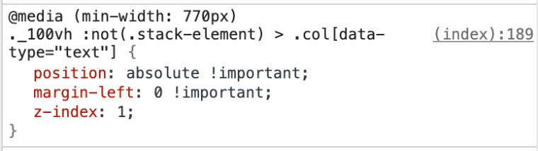
      0_1572956073786_c924e9ef-181e-4773-8f26-f37fdc5f2631-image.png

      Is there some CSS magic to make this work / centered?

      Thanks in advance!!

      ✦ ✦ ✦

      1 Reply Last reply
      0
      • mariusjopenM
        mariusjopenM
        mariusjopen
        Global Moderator
        wrote on last edited by
        #4

        Dear @edgrbnz

        Ah ok. I see it now.

        I can imagine to do something like this:

        ._center-1200.no-parallax.no-offset.col.push-1.span-10.align-middle {
            width: 60% !important;
            max-width: initial;
            left: 20% !important;
        }
        

        Best!

        Marius

        www.mariusjopen.world

        1 Reply Last reply
        0
        • edgrbnzE
          edgrbnzE
          edgrbnz
          wrote on last edited by edgrbnz
          #5

          🤔that unfortuntely doesn’t do the trick, though…

          If I leave the class:

          ._center-1200{
              max-width: 1200px;
              margin: auto!important;
          }
          

          in there, the:

          ._center-1200.no-parallax.no-offset.col.push-1.span-10.align-middle {
              width: 60% !important;
              max-width: initial;
              left: 20% !important;
          }
          

          doesn’t do anything.

          If I comment out my initial _center-1200 class your solution kinda mimics what Lay Theme does anyway: Even though the text-box is now centered it just gets wider… 😕like this:
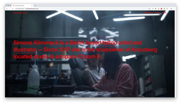
          0_1573039898768_Pasted_Image_06_11_19__12_31.jpg
          But what I’m trying to achive is that the text-box has a max-width of 1200px and stays centered on the page (instead of aligning to the left).
          Is that doable in any shape or form?


          PS:
          It works perfectly fine for complete rows (see here) but doesn’t seem to work for elements inside a row (which is mandatory in this case for the background image to be fullscreen).

          ✦ ✦ ✦

          1 Reply Last reply
          0
          • mariusjopenM
            mariusjopenM
            mariusjopen
            Global Moderator
            wrote on last edited by
            #6

            Dear @edgrbnz
            you could try display: flex:

            ._center-1200.no-parallax.no-offset.col.push-1.span-10.align-middle {
                width: initial !important;
                max-width: 1000px;
                margin-left: initial !important;
                margin-right: initial !important;
                position: relative !important;
                left: initial !important;
            }
            

            And to the parent box:

            .column-wrap {
                display: flex !important;
                justify-content: center;
                width: 100vw;
                flex-flow: column !important;
            }
            

            That might work.

            Best!

            Marius

            www.mariusjopen.world

            1 Reply Last reply
            0
            • edgrbnzE
              edgrbnzE
              edgrbnz
              wrote on last edited by edgrbnz
              #7

              Hi @mariusjopen
              that also didn’t work as expected… the column-wrap unfortunately messed up the layouts on all the other pages and the text box was sticking to the top of the page. I tryed some stuff with vertical-align: middle; which didn’t work either.

              I came up with this solution based on your CSS which kind does the trick:

              ._center-1200.no-parallax.no-offset.col.push-1.span-10.align-middle{
                  width: initial !important;
                  max-width: 1200px;
                  margin-top: 40vh;
                  margin-left: auto !important;
                  margin-right: auto !important;
                  padding: 0 5% 0 5%;
                  position: relative !important;
                  left: initial !important;
              }
              

              It looks fine for almost desktop resolutiona. Unfortunately the text ist moving upwards when the viewport get’s smaller. So it sticks to the header in a tablet resolution ~ 1024×768 which kinda looks wrong…
              If you got any constructive criticism and tipps to fix that I’m happy to learn!

              ✦ ✦ ✦

              1 Reply Last reply
              0
              • F
                F
                felix_rabe
                wrote on last edited by felix_rabe
                #8

                Try This:

                @media (min-width: 770px)
                ._center-1200.no-parallax.no-offset.col.push-1.span-10.align-middle {
                width: initial !important;
                max-width: 1200px;
                /* margin-top: 30vh; /
                margin-left: auto !important;
                margin-right: auto !important;
                padding: 0 5% 0 5%;
                /
                position: relative !important; */
                /left: initial !important;/

                Get rid of the "margin top" and the "position: relative" and the "left:initial" in this block.

                1 Reply Last reply
                0
                • edgrbnzE
                  edgrbnzE
                  edgrbnz
                  wrote on last edited by edgrbnz
                  #9

                  Hey @fr I tried your code as follows:

                  @media (min-width: 770px)
                  ._center-1200.no-parallax.no-offset.col.push-1.span-10.align-middle{
                      width: initial !important;
                      max-width: 1200px;
                      margin-left: auto !important;
                      margin-right: auto !important;
                      padding: 0 5% 0 5%;
                  }
                  

                  It kinda works… but it’s completely ignoring the max-width: 1200ox; again – see for yourself right here↗

                  It’s super weird what’s happening here; usually a centered text block with a max-width is a very easy thing to do, but I’m completely at loss what that CSS does and why it does it… 😔 might be due to the rather complex nature of the gridder?

                  Any help is more than appreciated!!

                  ✦ ✦ ✦

                  F 1 Reply Last reply
                  0
                  • edgrbnzE edgrbnz

                    Hey @fr I tried your code as follows:

                    @media (min-width: 770px)
                    ._center-1200.no-parallax.no-offset.col.push-1.span-10.align-middle{
                        width: initial !important;
                        max-width: 1200px;
                        margin-left: auto !important;
                        margin-right: auto !important;
                        padding: 0 5% 0 5%;
                    }
                    

                    It kinda works… but it’s completely ignoring the max-width: 1200ox; again – see for yourself right here↗

                    It’s super weird what’s happening here; usually a centered text block with a max-width is a very easy thing to do, but I’m completely at loss what that CSS does and why it does it… 😔 might be due to the rather complex nature of the gridder?

                    Any help is more than appreciated!!

                    F
                    F
                    felix_rabe
                    wrote on last edited by
                    #10

                    @edgrbnz

                    try this:
                    max-width: 1200px !important;

                    1 Reply Last reply
                    0
                    • edgrbnzE
                      edgrbnzE
                      edgrbnz
                      wrote on last edited by
                      #11

                      @fr I tried that before…
                      Unfortunately this doesn’t make any difference. (it’s online now)

                      ✦ ✦ ✦

                      1 Reply Last reply
                      0
                      • F
                        F
                        felix_rabe
                        wrote on last edited by
                        #12

                        you could try this in your css:

                        ._body_huge {
                        max-width: 1200px;
                        margin: auto;
                        }

                        1 Reply Last reply
                        0
                        • edgrbnzE
                          edgrbnzE
                          edgrbnz
                          wrote on last edited by
                          #13

                          Well, that worked!

                          However I added the class _center-1200 inside the text-element like this:

                          <p class="_body_huge _center-1200">Simone Klimmeck is a Berlin based…</p>
                          

                          The Custom CSS is super simple (which is a good thing) and looks like this:

                          ._center-1200 {
                          max-width: 1200px;
                          margin: auto!important;
                          }
                          

                          It doesn’t work when I right click the element and ‹add HTML class and id› inside the gridder, though. Which seems to be a bug of sorts?

                          Anyhow now this works but super strange that didn’t work otherwise.

                          ✦ ✦ ✦

                          1 Reply Last reply
                          0

                          Hello! It looks like you're interested in this conversation, but you don't have an account yet.

                          Getting fed up of having to scroll through the same posts each visit? When you register for an account, you'll always come back to exactly where you were before, and choose to be notified of new replies (either via email, or push notification). You'll also be able to save bookmarks and upvote posts to show your appreciation to other community members.

                          With your input, this post could be even better 💗

                          Register Login

                          Reply
                          • Reply as topic
                          Log in to reply
                          • Oldest to Newest
                          • Newest to Oldest
                          • Most Votes


                          Online Users
                          OLVVDBO
                          OLVVDB
                          L
                          lstark
                          Forgot your key, lost your files, need a previous Lay Theme or Addon version? Go to www.laykeymanager.com
                          laytheme.com
                          • Login

                          • Don't have an account? Register

                          • Login or register to search.
                          • First post
                            Last post
                          0
                          • Recent
                          • Tags
                          • Popular
                          • Users
                          • Search