Mobile Layout: Portrait Images
-
Dear Armin and Marius
First of all: Thanks for Laytheme, its great!
For my website I use the carousel addon in a fullscreen slider.
In the desktop version I activated "100vh" and "multiple slides showed" in my carousels.
Here my website: www.fabiennewyss.comFor the mobile version I do not want to use the fullscreen slider nor the multiple slides. Here I activated in my carousel: "80vh" and slides width "100%". Works good so far, but I want the portrait images to be shown 100% in height (within the 80vh carousel) and the landscape images 100% in width. Is there any possibility to do so?
As I do know just some html basics, I do really appreciate your help!
Thanks!
Best, Fabienne -
Dear @fabiennne
It looks like this problem is solved, no?
Or do I miss something?
Best!
Marius -
Dear @mariusjopen
No, not really.
It depends on the device. With iphone 5/SE it looks like it would be solved, but if you have a look at a bigger mobile device, you will see the problem:
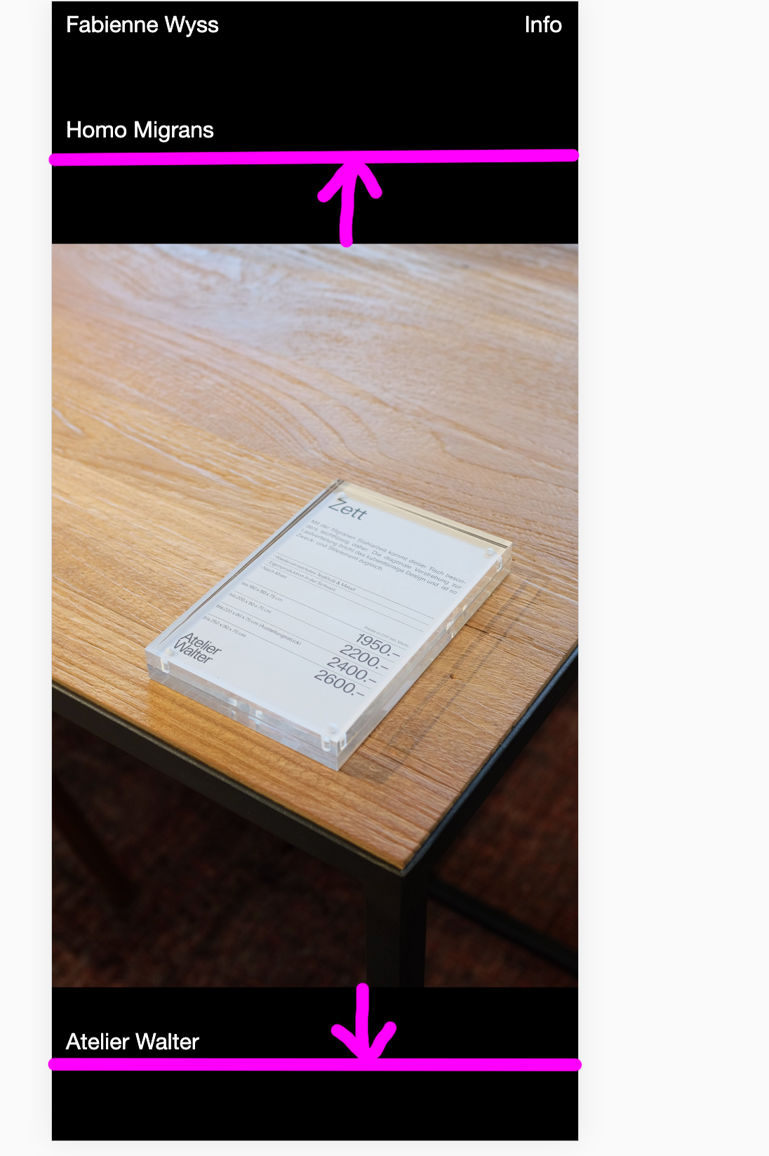
Thanks a lot!
Fabienne -
Dear @fabiennne
There is not really a "right" way to do this. You need to dig into the CSS. Do you have a friend who knows some CSS?
Best!
Marius

Hello! It looks like you're interested in this conversation, but you don't have an account yet.
Getting fed up of having to scroll through the same posts each visit? When you register for an account, you'll always come back to exactly where you were before, and choose to be notified of new replies (either via email, or push notification). You'll also be able to save bookmarks and upvote posts to show your appreciation to other community members.
With your input, this post could be even better 💗
Register Login