Mobile menu customizations
-
Can somebody help me to customize a mobile menu (Style 2).
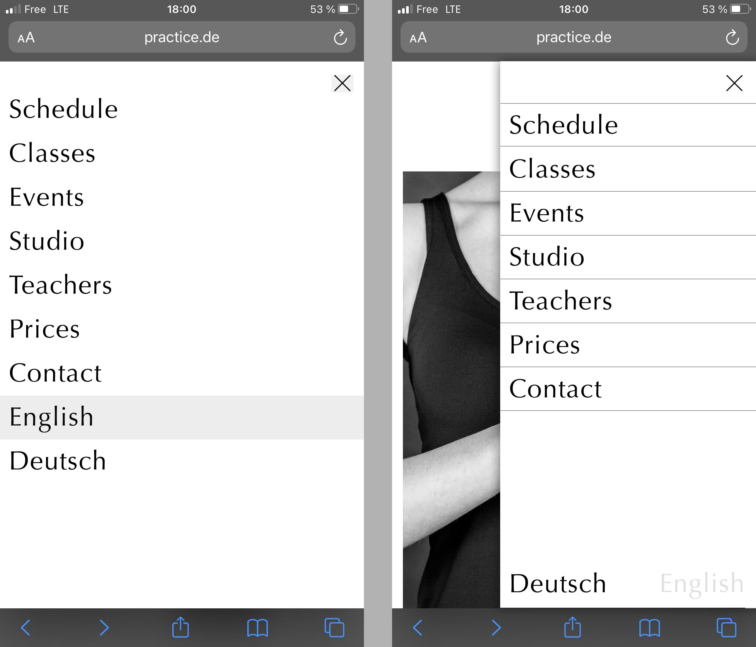
It's not much I need to change but it exceeds my abilities.The attached images show what I need (left side shows the current status): https://practice.de/
- Lines between menu points.
- The menu should fill the screen horizontally only 70%.
- A shadow on the left edge.
- Language names should be placed at the bottom.
If this is too much to explain in a few lines, I'm also read to pay someone to do it.
All the best and thank you for your help — Ben
-
Dear Ben
@doorofperception
This was a fast attempt to hopefully set you in the right direction, possibly not the most efficient way to do so, apologies that i cannot help further 🌝
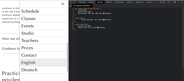
nav.laynav.mobile-nav.active {
    width:70%;
    margin-left:30%;
    box-shadow: 0px 0px 10px 0px #aaaaaa;
}

.menu-item {
        border-bottom: 1px solid #c4c4c4;
}

.menu-item-194 {
    margin-top:20px;
    border-top: 1px solid #c4c4c4;
}
Sincerely
Richard
-
That was indeed helpful. Thank you Richard, almost there.
When I close the menu now, it jumps to 100% width to fill the screen and closes from there. And it doesn't close when click besides the menu, that would make a lot of sense.
I give up the special placing of the language switcher, that's clearly a bit more work.
-
Dear @doorofperception
Unfortunately I'm unable help further at present with your Custom Code, I hope other users may speak up if they can help 🌝
Sincerely
Richard