no scrolling on Overflowing table
-
Hello everyone,
I am working on the website https://www.annakubelik.com/cv/ and am happy with the way things look in desktop. However, when viewing the list of exhibitions on mobile, I cannot scroll to the right to see the full line.
I tried with custom CSS for all td elements, setting overflow to auto and/or table-layout to auto did not net the desired results. What could be a solution to this?Thank you,
Julius -
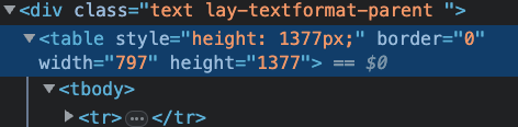
ure using a table with a fixed width of 797px
i think thats the default table behaviour of the texteditor table
however, on mobile the screen width is smaller
i think u could use this css
table{
max-width: 797px!important;
width: 100%!important;
}
this way the table width would shrink on mobile
i think i should somehow create a table element or sth
-
ure using a table with a fixed width of 797px
i think thats the default table behaviour of the texteditor table
however, on mobile the screen width is smaller
i think u could use this css
table{
max-width: 797px!important;
width: 100%!important;
}
this way the table width would shrink on mobile
i think i should somehow create a table element or sth
@arminunruh that worked, thanks! Table styling is something I keep coming back to, especially for CVs etc. so that would be greatly appreciated – at least on my end :)

Hello! It looks like you're interested in this conversation, but you don't have an account yet.
Getting fed up of having to scroll through the same posts each visit? When you register for an account, you'll always come back to exactly where you were before, and choose to be notified of new replies (either via email, or push notification). You'll also be able to save bookmarks and upvote posts to show your appreciation to other community members.
With your input, this post could be even better 💗
Register Login