Mobile homepage image – how to align image to the bottom of the viewport?
-
Hi everyone,
I’m working on a website with Lay Theme and I’m having an issue with an image on my homepage in the mobile version.
I would like the image to always be aligned to the bottom of the screen/viewport, without any white space underneath it.
The image itself does not have such a large white border. However, it seems that Lay Theme is centering the image within its container, which results in additional white space being added both above and below the image. I would like the image to sit at the bottom instead of being vertically centered.
Is there a native Lay Theme setting or option that allows me to control the vertical positioning of the image in this way? Or would this require custom CSS?
Thanks in advance for any help!
-
do you have a link?
i think if you make your row browser height and then place it at the bottom this should work.
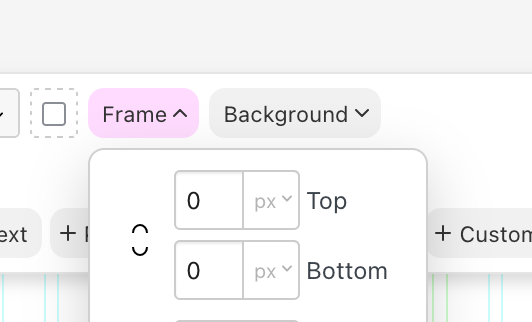
set frame top and bottom to 0
make row browser height
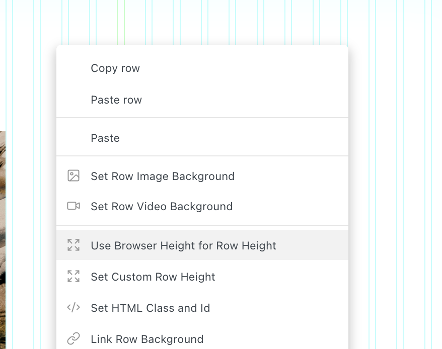
in the row's context menu.
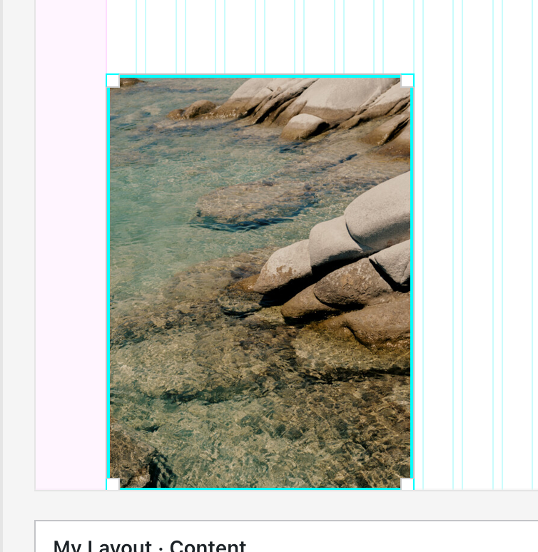
then align your image to the bottom:
if u select the row, you can even make the row fixed in the sidebar:
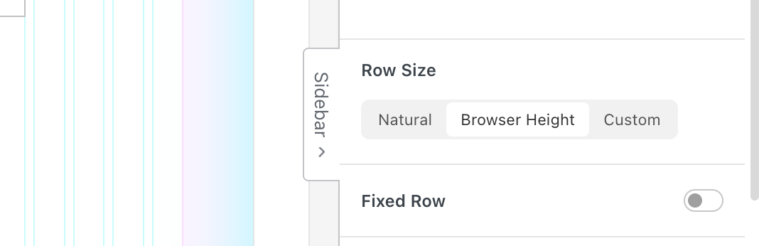
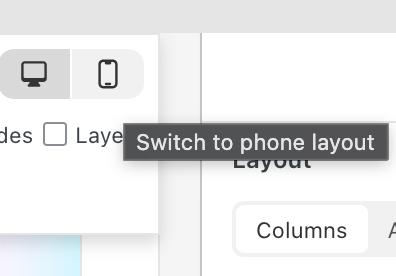
to do this for mobile, make sure to use a custom phone layout:

Hello! It looks like you're interested in this conversation, but you don't have an account yet.
Getting fed up of having to scroll through the same posts each visit? When you register for an account, you'll always come back to exactly where you were before, and choose to be notified of new replies (either via email, or push notification). You'll also be able to save bookmarks and upvote posts to show your appreciation to other community members.
With your input, this post could be even better 💗
Register Login