Secondary Menus in Mobile
-
Hi all!
I was wondering if there is any way of separating with a space or keyline/differentiating with scale, position or any other hierarchy the primary menu from the secondary menu on the MOBILE version.
http://coachingemocional.es/es
The screenshot attached shows how both Menus have been merged into one (from Home onwards) and it would be crucial to be able to define a difference between both menus!
Any CSS that can be applied to this?Thanks a lot in advance for your help!
Best,Christian

-
Dear @cschm-tz
Yes :)
You could do this with Custom CSS in "Lay-options" - "Custom CSS & HTML"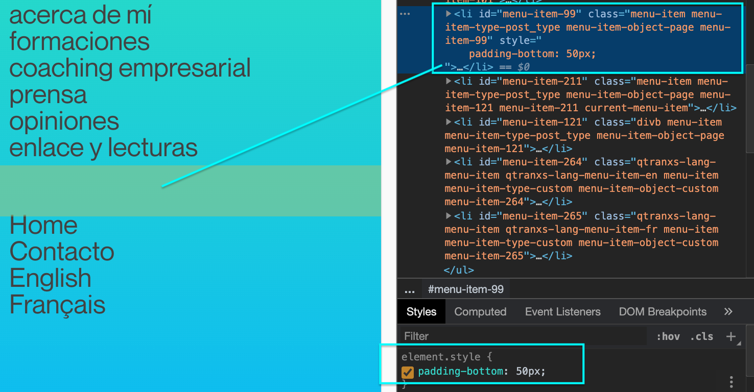
You can target the individual menu items to your choosing as they each have their own id.
In the quick example above i gave "menu-item-99" a padding-bottom of 50px.
So your code could look something like
.mobile-nav #menu-item-99{
padding-bottom: 50px;

}
The "mobile-nav" is there in front so that it just adds the padding on the mobile menu.
Hope this helps you!
Best
Richard -
Dear @cschm-tz
Yes :)
You could do this with Custom CSS in "Lay-options" - "Custom CSS & HTML"You can target the individual menu items to your choosing as they each have their own id.
In the quick example above i gave "menu-item-99" a padding-bottom of 50px.
So your code could look something like
.mobile-nav #menu-item-99{
padding-bottom: 50px;

}
The "mobile-nav" is there in front so that it just adds the padding on the mobile menu.
Hope this helps you!
Best
Richard