Text placement over background image gets lost on mobile
-
Hi there,
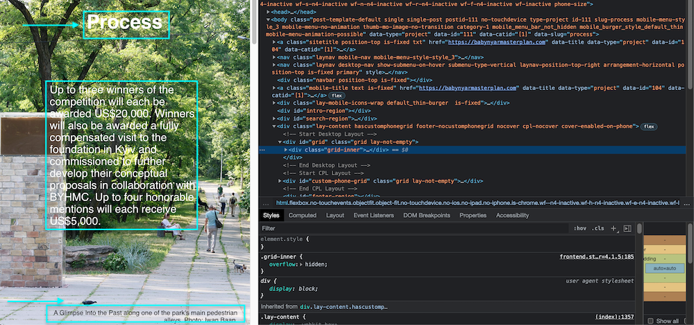
Been getting to know and enjoying the Lay Theme recently. I'm building a website that relies a lot on full-screen-height background images, or "Row Image Backgrounds" with "Use Browser Height for Row Height." It's working out great, but only on desktop. I have bigger text in the middle of the image, smaller towards the bottom, and a caption at the very bottom. But when I resize and go to tablet or mobile, this entire text placement formatting gets lost; all the text goes into different places. Is there any easy way to fix this (besides custom-coding each placement in CCS—assuming that's even possible...)?Here's the website, for reference: www.babynyarmasterplan.com
Thank you!
-
Dear @alucidwake
Maybe i am a bit late to this sorry, is there still an issue with text and image clashing? 🔍
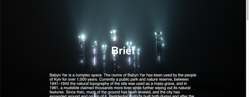
BTW: That mirror's at night picture is so cool: 💥
Talk soon
Richard
-
Thanks so much Richard! Everything is working now; I had to discover the "Activate custom phone layouts" option in settings and then set the layout for each page individually.
-
Dear @alucidwake
Happy to hear all is working now for you, thank you for coming back and providing a conclusion to the thread 🌝
Best of luck
Richard

Hello! It looks like you're interested in this conversation, but you don't have an account yet.
Getting fed up of having to scroll through the same posts each visit? When you register for an account, you'll always come back to exactly where you were before, and choose to be notified of new replies (either via email, or push notification). You'll also be able to save bookmarks and upvote posts to show your appreciation to other community members.
With your input, this post could be even better 💗
Register Login