hide menu-bar on mobile site doesn't work
-
Hi!
On my site https://tanzhausbern.ch/einstieg/
I would like to hide the menu bar, side-title and menu icons in order do show the carousel in fullscreen – like this
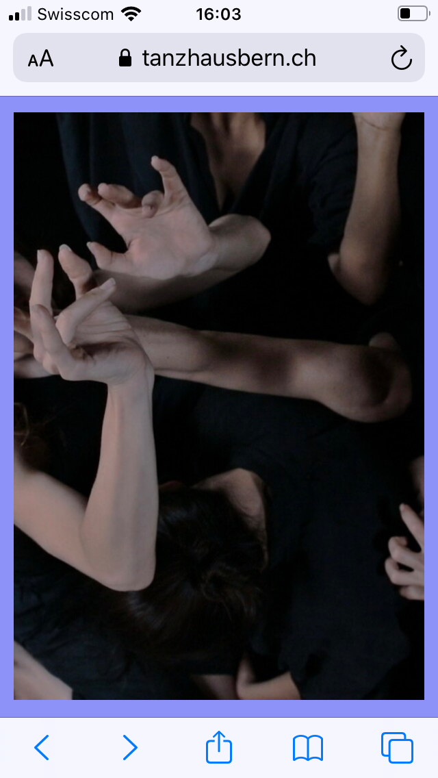
I tried to do that in the costume css for mobile area with the following code:
body.slug-einstieg .mobile-title,
body.slug-einstieg .burger {
display: none!important;
}

body.slug-einstieg .navbar {
height: 0px!important;
z-index:0!important;
}
I also tried:
body.slug-einstieg .mobile-title,
body.slug-einstieg .burger,
body.slug-einstieg .navbar {
display: none!important;
both versions work for the side-title and the burger, but not for the menu-bar:
it still takes the height of the menu-bar settings as top-frame (65px)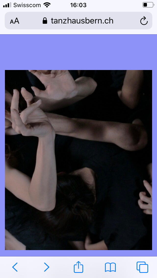
the carousel has class and id 'einstieg' , the row on which it is placed has class and id 'frontrow'
and I tried to shift the carousel on top and front of the page by the following code:#einstieg { top:0px!important; z-index:100000!important; } #frontrow { top:0px!important; z-index:100000!important; }but it didn't work.
do you know how I can get rid of the menu-bar offset?Thankyou for helping!
Best,
Florine -
hey can you search the forum i think we had a similar post here
you only want to hide the menubar for that one page right
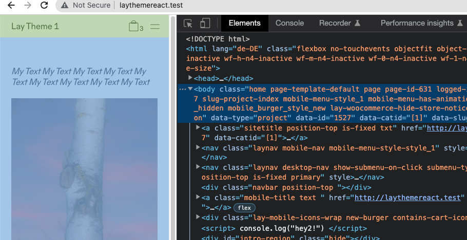
take a look.
body has a padding topjust make it have a padding top of 0
-

Hello! It looks like you're interested in this conversation, but you don't have an account yet.
Getting fed up of having to scroll through the same posts each visit? When you register for an account, you'll always come back to exactly where you were before, and choose to be notified of new replies (either via email, or push notification). You'll also be able to save bookmarks and upvote posts to show your appreciation to other community members.
With your input, this post could be even better 💗
Register Login