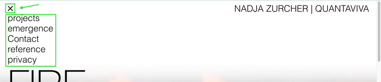
Burger menu in desktop website
-
Dear @heleneleuzinger
We would not recommend to change the code inside the theme folder. It will get overwritten with the next update. Try to use the CUSTOM CSS and JQUERY section.
Best!
Marius -
Hi @heleneleuzinger
You'd find most of the relevant CSS code in frontend/style_phone.php: look for .mobile-nav and the relevant mobile-menu-style. As I said, this solution isn't ideal, as lay upgrades might make your custom CSS code faulty.
The more stable approach I'd recommend is to use custom CSS and JS to adjust the appearance and behaviour of the desktop menu itself...
Best -
Dear @heleneleuzinger
We would not recommend to change the code inside the theme folder. It will get overwritten with the next update. Try to use the CUSTOM CSS and JQUERY section.
Best!
Marius -
Dear @heleneleuzinger
We would not recommend to change the code inside the theme folder. It will get overwritten with the next update. Try to use the CUSTOM CSS and JQUERY section.
Best!
Marius@mariusjopen That's the idea...
-
Thank you very much! I'll try my hand at that :-)
-
Dear @heleneleuzinger
Perfect! Glad to hear!
Many wishes!
Marius -
Is there any way of doing this now? Or any kind soul would share their work around?
Thanks :))
-
Use the following custom CSS and JS to adjust the appearance and behaviour of the desktop menu. You can see it in action on https://quantaviva.ch
Custom CSS for Desktop Version:
nav.laynav.primary:before {
    display: block;
    content: "–––\A–––\A–––";
    white-space: pre-wrap;
    line-height: 0.6em;
    font-weight: 900;
    cursor: pointer;
}
    nav.laynav.primary.toggled:before {
        content: "✕";
        font-size: 1.5em;
        line-height: 1.15em;
    }
nav.laynav ul {
    display: none;
    width: 96vw;
    background: #fff;
}
Custom <head> content:
<script> jQuery( document ).ready(function( $ ) { $(".laynav.primary").on("click", function(e){ $(this).toggleClass("toggled").children("ul").toggle(); }); }); </script> -
-
oh cool - thanks @brogr :))


Hello! It looks like you're interested in this conversation, but you don't have an account yet.
Getting fed up of having to scroll through the same posts each visit? When you register for an account, you'll always come back to exactly where you were before, and choose to be notified of new replies (either via email, or push notification). You'll also be able to save bookmarks and upvote posts to show your appreciation to other community members.
With your input, this post could be even better 💗
Register Login