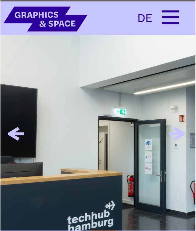
So I am using the hamburger menu style from the customize panel but I want to add an item from the menu next to it, like on the screenshot. is this possible?
thanks for the help!
So I am using the hamburger menu style from the customize panel but I want to add an item from the menu next to it, like on the screenshot. is this possible?
thanks for the help!
It would be nice to make the columns stack, instead of becoming really narrow. In the element grid you can customize for tablet and mobile display. :-)
Is there a way to customize how the table element displays in tablet and mobile devices? I couldn't find it but it would definitely be nice. Similar to the element grid customization options at the bottom left.
Hey, thanks for your reply. I did add the HTML to the mobile site title, but it's still not displaying unfortunately.
Hi!
So I created a responsive Logo with CSS and SVG shapes. I would like for it to display the same in desktop/tablet/mobile. The problem is that when I add the same HTML/CSS from the destop to the mobile, it doesn't display anymore. Anyone have an Idea why this might be? My website is www.er-sc.com
The homepage I'm making at the moment (https://2025-website.er-sc.com/) has a thumbnail grid, but the width of the homepage in the mobile version is wider than the browser window. How can I avoid this?
Also, I put a video at the top, which is not autoplaying as it should, also in the mobile version. Any ideas how to solve this?
Thanks!