Skip to content
  • Recent
  • Tags
  • Popular
  • Users
  • Search
Skins
  • Light
  • Brite
  • Cerulean
  • Cosmo
  • Flatly
  • Journal
  • Litera
  • Lumen
  • Lux
  • Materia
  • Minty
  • Morph
  • Pulse
  • Sandstone
  • Simplex
  • Sketchy
  • Spacelab
  • United
  • Yeti
  • Zephyr
  • Dark
  • Cyborg
  • Darkly
  • Quartz
  • Slate
  • Solar
  • Superhero
  • Vapor

  • Default (No Skin)
  • No Skin
Collapse

Lay Theme Forum

  1. Home
  2. General Discussion
  3. Use different menu position for "Datenschutzerklärung"?

Use different menu position for "Datenschutzerklärung"?

Scheduled Pinned Locked Moved General Discussion
23 Posts 3 Posters 1.6k Views
  • Oldest to Newest
  • Newest to Oldest
  • Most Votes
Reply
  • Reply as topic
Log in to reply
This topic has been deleted. Only users with topic management privileges can see it.
  • D Offline
    D Offline
    danny
    wrote on last edited by
    #10

    Dear @mariusjopen,

    for the mobile version of http://people-berlin.karuna-ev.de:

    is it possible to have the menu point DATENSCHUTZ http://people-berlin.karuna-ev.de/datenschutz/ as well in smaller size and outside of the main menu as in the desktop version? Because it is not as important as the rest of the main menu.

    So it works for the Desktop Version but not for the Mobile Version.

    So it's really simple: MOBILE should the menu point DATENSCHUTZ be similar small in the left corner as in the DESKTOP version. And not appear in the main menu.

    Thanks a lot.

    Best wishes

    Daniel

    1 Reply Last reply
    0
    • edgrbnzE Offline
      edgrbnzE Offline
      edgrbnz
      wrote on last edited by
      #11

      As far as I understand something along these lines inside Custom CSS for Mobile Version should do the trick:

      #menu-item-1504,
      #menu-item-1531 {
         font-size: 10px;
      }
      

      It targets the desired menu elements of News and Datenschutzerklärung and sets the font size to 10px.

      ✦ ✦ ✦

      1 Reply Last reply
      0
      • D Offline
        D Offline
        danny
        wrote on last edited by
        #12

        thanks!

        doesn't work though ((

        but thats probably because of that?

        body.use-desktop-menu-as-mobile-menu nav.mobile-nav ul {
        display: flex;
        flex-direction: column;
        height: calc(90vh - 24px);
        justify-content: space-between;
        }
        #menu-item-1531 {
        font-size: 10px;
        }

        1 Reply Last reply
        0
        • D Offline
          D Offline
          danny
          wrote on last edited by
          #13

          Dear @mariusjopen,

          did you changed the mobile menu? Because suddenly the menu is all small?? Please put it back.

          Thanks!

          Best wishes
          Daniel

          1 Reply Last reply
          0
          • edgrbnzE Offline
            edgrbnzE Offline
            edgrbnz
            wrote on last edited by
            #14

            I’m unable to change anything on your site. I just tryed the CSS mentioned above inside the dev-console of my browser which just has a temporary local effect on my machine.

            You probably added the CSS mentioned above and it has some effect 😊
            Either play around with the settings for font-size and the menu-items and see if you could make it work as desired or just remove

            #menu-item-1531 {
               font-size: 10px;
            }
            

            and it should all be back to normal.

            ✦ ✦ ✦

            1 Reply Last reply
            0
            • D Offline
              D Offline
              danny
              wrote on last edited by
              #15

              thanks! it's back ))

              now we still searching for how can we have MOBIL "Datenschutzerklärung" small in the left corner as in the DESKTOP version.

              I tried your CSS Code in the Custom CSS for Mobile Version but unfortunately it didn't work.

              thanks again,

              Daniel

              1 Reply Last reply
              0
              • D Offline
                D Offline
                danny
                wrote on last edited by
                #16

                Hi @edgrbnz,
                Hi @mariusjopen

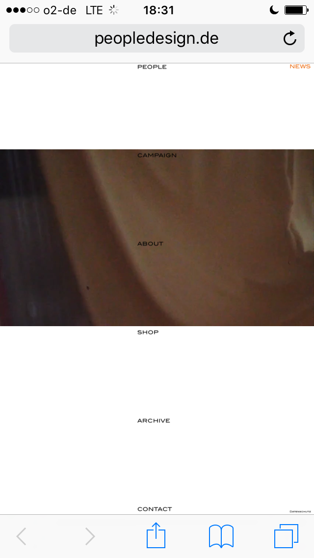
                we just noticed, that the "frame forwarding" domain peopledesign.de still features the to small menu. As the original people-berlin.karuna-ev.de works just right.

                Do you have any idea how this comes?

                Thanks a lot.

                All best wishes

                Daniel

                1_1558024518071_IMG_8996.PNG 0_1558024518071_IMG_8995.PNG

                1 Reply Last reply
                0
                • edgrbnzE Offline
                  edgrbnzE Offline
                  edgrbnz
                  wrote on last edited by edgrbnz
                  #17

                  Hmmm… I don’t know much about frame forwarding.
                  I’d move the site to the URL where you want it to live. Any weird forwarding can do all sorts of unpredictable things.

                  The undesired behaviours could be caused by a cache issue, it could also be a database issue (wordpress addressing something that’s somewhere else), etc. In addition, if you want your page to rank somewhat normal in search results frame forwarding or forwarding in general isn’t really recommended.

                  I’d suggest to keep your website setup as straight forward as possible.

                  This is waaay beyond my ken → Perhaps @mariusjopen or @arminunruh can help with this?

                  ✦ ✦ ✦

                  1 Reply Last reply
                  0
                  • mariusjopenM Offline
                    mariusjopenM Offline
                    mariusjopen
                    Global Moderator
                    wrote on last edited by
                    #18

                    Dear @danny
                    yes. I agree with @edgrbnz. I would not recommend to use this forwarding method.
                    Responsive might cause problems.

                    Best is to move the page either manually or with a migration tool like Updraft Plus.

                    Best!

                    Marius

                    www.mariusjopen.world

                    1 Reply Last reply
                    1
                    • D Offline
                      D Offline
                      danny
                      wrote on last edited by
                      #19

                      Dear @edgrbnz and @mariusjopen

                      that's very good to know, thanks for that!

                      Would you have another suggestion to have the menu point DATENSCHUTZ http://people-berlin.karuna-ev.de/datenschutz/ as well in smaller size and outside of the main menu as in the desktop version? Because it is not as important as the rest of the main menu.

                      Thanks again.

                      All best

                      Daniel

                      1 Reply Last reply
                      0
                      • edgrbnzE Offline
                        edgrbnzE Offline
                        edgrbnz
                        wrote on last edited by
                        #20

                        How about putting it inside a footer?

                        ✦ ✦ ✦

                        1 Reply Last reply
                        0
                        • mariusjopenM Offline
                          mariusjopenM Offline
                          mariusjopen
                          Global Moderator
                          wrote on last edited by
                          #21

                          Dear @danny
                          or put it into the HTML section and hide it on desktop with CSS.

                          Best!

                          MArius

                          www.mariusjopen.world

                          1 Reply Last reply
                          0
                          • D Offline
                            D Offline
                            danny
                            wrote on last edited by
                            #22

                            Dear @edgrbnz @mariusjopen

                            thanks, Footer sounds good - I just tried it. How do you edit and design the footer? Couldn't find any options for that.

                            Thanks. Best wishes

                            Daniel

                            1 Reply Last reply
                            0
                            • mariusjopenM Offline
                              mariusjopenM Offline
                              mariusjopen
                              Global Moderator
                              wrote on last edited by
                              #23

                              Dear @danny
                              the footer is an own page. You can access it with CUSTOM CSS.
                              Have a look with the Inspector Tool.

                              Best!

                              Marius

                              www.mariusjopen.world

                              1 Reply Last reply
                              1
                              Reply
                              • Reply as topic
                              Log in to reply
                              • Oldest to Newest
                              • Newest to Oldest
                              • Most Votes


                              I also code custom websites or custom Lay features.
                              💿 Email me here: 💿
                              info@laytheme.com

                              Our Web Development company: 100k.studio

                              Want to tip me? https://www.paypal.com/paypalme/arminunruh

                              Before you post:
                              1. When using a WordPress Cache plugin, disable it or clear your cache.
                              2. Update Lay Theme and all Lay Theme Addons
                              3. Disable all Plugins
                              4. Go to Lay Options → Custom CSS & HTML, click "Turn Off All Custom Code", click "Save Changes"

                              This often solves issues you might run into

                              When you post:
                              1. Post a link to where the problem is
                              2. Does the problem happen on Chrome, Firefox, Safari or iPhone or Android?
                              3. If the problem is difficult to explain, post screenshots / link to a video to explain it
                              Online Users
                              C
                              c_mich
                              Forgot your key, lost your files, need a previous Lay Theme or Addon version? Go to www.laykeymanager.com
                              laytheme.com
                              • Login

                              • Don't have an account? Register

                              • Login or register to search.
                              • First post
                                Last post
                              0
                              • Recent
                              • Tags
                              • Popular
                              • Users
                              • Search