Centered Textblock
-
Not really…
It unfortunately sticks to the left above the 1200px max-width.So if the site gets viewed on a screen with a common resolution around 1920px in width the text oddly sticks to the left.
It seems like my class gets overwritten by this one:
Is there some CSS magic to make this work / centered?
Thanks in advance!!
-
Dear @edgrbnz
Ah ok. I see it now.
I can imagine to do something like this:
._center-1200.no-parallax.no-offset.col.push-1.span-10.align-middle {
    width: 60% !important;
    max-width: initial;
    left: 20% !important;
}
Best!
Marius
-
🤔that unfortuntely doesn’t do the trick, though…
If I leave the class:
._center-1200{
    max-width: 1200px;
    margin: auto!important;
}
in there, the:
._center-1200.no-parallax.no-offset.col.push-1.span-10.align-middle {
    width: 60% !important;
    max-width: initial;
    left: 20% !important;
}
doesn’t do anything.
If I comment out my initial
_center-1200class your solution kinda mimics what Lay Theme does anyway: Even though the text-box is now centered it just gets wider… 😕like this:
But what I’m trying to achive is that the text-box has a max-width of 1200px and stays centered on the page (instead of aligning to the left).
Is that doable in any shape or form?
PS:
It works perfectly fine for complete rows (see here) but doesn’t seem to work for elements inside a row (which is mandatory in this case for the background image to be fullscreen). -
Dear @edgrbnz
you could try display: flex:._center-1200.no-parallax.no-offset.col.push-1.span-10.align-middle { width: initial !important; max-width: 1000px; margin-left: initial !important; margin-right: initial !important; position: relative !important; left: initial !important; }And to the parent box:
.column-wrap {
    display: flex !important;
    justify-content: center;
    width: 100vw;
    flex-flow: column !important;
}
That might work.
Best!
Marius
-
Hi @mariusjopen
that also didn’t work as expected… thecolumn-wrapunfortunately messed up the layouts on all the other pages and the text box was sticking to the top of the page. I tryed some stuff withvertical-align: middle;which didn’t work either.I came up with this solution based on your CSS which kind does the trick:
._center-1200.no-parallax.no-offset.col.push-1.span-10.align-middle{
    width: initial !important;
    max-width: 1200px;
    margin-top: 40vh;
    margin-left: auto !important;
    margin-right: auto !important;
    padding: 0 5% 0 5%;
    position: relative !important;
    left: initial !important;
}
It looks fine for almost desktop resolutiona. Unfortunately the text ist moving upwards when the viewport get’s smaller. So it sticks to the header in a tablet resolution ~ 1024×768 which kinda looks wrong…
If you got any constructive criticism and tipps to fix that I’m happy to learn! -
Try This:
@media (min-width: 770px)
._center-1200.no-parallax.no-offset.col.push-1.span-10.align-middle {
width: initial !important;
max-width: 1200px;
/* margin-top: 30vh; /
margin-left: auto !important;
margin-right: auto !important;
padding: 0 5% 0 5%;
/ position: relative !important; */
/left: initial !important;/Get rid of the "margin top" and the "position: relative" and the "left:initial" in this block.
-
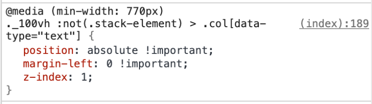
Hey @fr I tried your code as follows:
@media (min-width: 770px)
._center-1200.no-parallax.no-offset.col.push-1.span-10.align-middle{
    width: initial !important;
    max-width: 1200px;
    margin-left: auto !important;
    margin-right: auto !important;
    padding: 0 5% 0 5%;
}
It kinda works… but it’s completely ignoring the
max-width: 1200ox;again – see for yourself right here↗It’s super weird what’s happening here; usually a centered text block with a
max-widthis a very easy thing to do, but I’m completely at loss what that CSS does and why it does it… 😔 might be due to the rather complex nature of the gridder?Any help is more than appreciated!!
-
Hey @fr I tried your code as follows:
@media (min-width: 770px)
._center-1200.no-parallax.no-offset.col.push-1.span-10.align-middle{
    width: initial !important;
    max-width: 1200px;
    margin-left: auto !important;
    margin-right: auto !important;
    padding: 0 5% 0 5%;
}
It kinda works… but it’s completely ignoring the
max-width: 1200ox;again – see for yourself right here↗It’s super weird what’s happening here; usually a centered text block with a
max-widthis a very easy thing to do, but I’m completely at loss what that CSS does and why it does it… 😔 might be due to the rather complex nature of the gridder?Any help is more than appreciated!!
try this:
max-width: 1200px !important; -
you could try this in your css:
._body_huge {
max-width: 1200px;
margin: auto;
} -
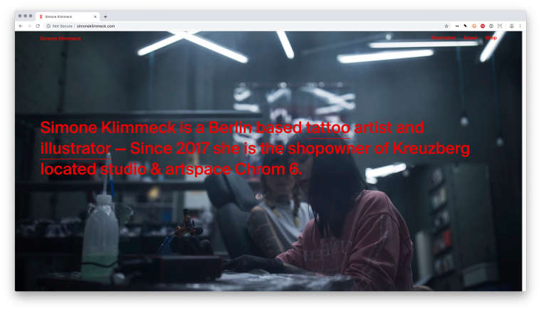
Well, that worked!
However I added the class
_center-1200inside the text-element like this:<p class="_body_huge _center-1200">Simone Klimmeck is a Berlin based…</p>The Custom CSS is super simple (which is a good thing) and looks like this:
._center-1200 {
max-width: 1200px;
margin: auto!important;
}
It doesn’t work when I right click the element and ‹add HTML class and id› inside the gridder, though. Which seems to be a bug of sorts?
Anyhow now this works but super strange that didn’t work otherwise.
For 1on1 paid Lay Theme Coaching, contact: audrey@cyberslayers.work.
We also code custom websites or custom Lay features.
💿 Email us here: 💿
info@laytheme.com
Our Web Development company: 100k.studio
Want to tip me? https://www.paypal.com/paypalme/arminunruh
Before you post:
- When using a WordPress Cache plugin, disable it or clear your cache.
- Update Lay Theme and all Lay Theme Addons
- Disable all Plugins
- Go to Lay Options → Custom CSS & HTML, click "Turn Off All Custom Code", click "Save Changes"
This often solves issues you might run into
When you post:
- Post a link to where the problem is
- Does the problem happen on Chrome, Firefox, Safari or iPhone or Android?
- If the problem is difficult to explain, post screenshots / link to a video to explain it