Thanks, Armin. This seems to work well for me.
M
MWPA
@MWPA
Posts
-
**Bug report: browser UI bar does not hide on scroll for project pages on mobile (Safari & Chrome iOS)** -
**Bug report: carousel-lazy-img not loading in Safari 26 (macOS 26.5)**Thanks, Armin. It seems the update fixed the problem.
-
**Bug report: browser UI bar does not hide on scroll for project pages on mobile (Safari & Chrome iOS)** -
**Bug report: browser UI bar does not hide on scroll for project pages on mobile (Safari & Chrome iOS)**Hi,
On mobile, the browser navigation bar at the bottom of the screen does not disappear when scrolling down on project/work pages. This issue occurs in both Safari and Chrome on iOS 26.
On regular pages (e.g. news, about, contact) the browser UI behaves correctly — it hides when scrolling down as expected. The problem is specific to project pages using the carousel/gallery layout.
What's happening
It appears the project page layout prevents the browser from triggering its scroll-to-hide UI behaviour. The bottom bar remains permanently visible, covering the lower portion of the page content. Because the bar does not hide, the bottom of the page is partially obscured and unreachable.
This affects both Safari and Chrome on iOS 26, which suggests it is related to how the page layout or scrolling container is structured — Chrome on iOS uses the same WebKit engine as Safari, so both are affected equally.
Steps to reproduce
- Open a project/work page on an iPhone running iOS 26
- Try scrolling down
- The browser UI bar at the bottom remains visible and does not collapse
- The same behaviour does not occur on regular (non-carousel) pages
Environment
- Lay Theme (latest version)
- WordPress 7.0
- iOS 26, Safari 26 and Chrome on iOS
- Does not affect regular pages, only project/carousel pages
Happy to share a URL for testing. Thanks!
-
**Bug report: carousel-lazy-img not loading in Safari 26 (macOS 26.5)** -
**Bug report: carousel-lazy-img not loading in Safari 26 (macOS 26.5)**Hi,
Images on project/work pages using the carousel layout fail to load in Safari 26 on macOS 26.5. The same pages load perfectly in Firefox and Chrome.
What's happening
Lay Theme uses
data-lay-srcanddata-lay-srcsetattributes on images with the classcarousel-lazy-imgto handle lazy loading. In Safari 26, the lazy loader (frontend.app.min.js) does not swap these attributes into the actualsrcandsrcset— so images remain as base64 placeholders and never load.I confirmed this by inspecting the DOM in Safari's DevTools. The
data-lay-srcattribute is correctly present in the HTML, but the imagesrcis never updated from the placeholder. No JavaScript errors appear in the console. The network tab shows zero image requests being made for the carousel images, confirming the lazy loader simply never triggers in Safari 26.Steps to reproduce
- Create a page using the carousel/gallery layout with multiple images
- Open the page in Safari 26 on macOS 26.5
- Images remain blank — only base64 placeholder GIFs are shown
Environment
- Lay Theme (latest version)
- WordPress 7.0
- Safari 26, macOS 26.5
- Affects both desktop and iOS Safari 26
Happy to provide a test URL if that helps. Thanks!
-
Lightbox shows images from front page instead of current project pageGreat, Armin. Any idea when the next update will be released?
-
Lightbox shows images from front page instead of current project pageExtra debugging info:
The issue seems related to the Lightbox Addon collecting images that are present in the DOM but not part of the current project content.
On a direct load of a project page:
- the body tag is correct and shows data-type="project" and the correct project data-id
- the visible project images are correct
- the clicked project image has the correct data-id, for example data-id="97"
- however, the opened lightbox image has a different data-id, for example data-id="1081", and belongs to the static front page/news page
I searched the DOM and found that the wrong frontpage/news images are present inside the project page DOM, although they are not visible on the page.
They appear inside rows with classes like:
absolute-positioning-vertically-in-apl
The image column has attributes like:
data-type="img"
data-yvel="1"The lightbox then opens a Swiper gallery with the frontpage/news images, for example 1 / 12.
Important detail:
If I temporarily disable the static front page in Settings → Reading, direct project page loads open the correct project images in the lightbox. When I set /news as the static front page again, the issue returns.So it looks like the Lightbox Addon may be collecting hidden APL/frontpage images from the DOM on direct project page load, instead of only collecting images from the current project content.
This happens even though the frontpage/news page itself does not have Lightbox enabled.
-
Lightbox shows images from front page instead of current project pageHi,
I’m seeing a lightbox issue on a project page I’m working on.
When I click an image here:
https://dev.nataschalibbert.nl/work/undermined/
…the lightbox does not show images from that project page. Instead, it opens/shows images from a normal page, specifically the News page, which is set as the front page.
Does anybody know how this is possible and how to fix it?
Thanks.
-
Element Grid displaying images in wrong order and misalignedHere is an example, on a page where all elements have the same aspect ratio, and the masonry layout is also working correctly:
https://vandersalm-architecten.nl/project/woonensemble-homeruskwartier/
-
Element Grid displaying images in wrong order and misalignedThat is quite strange, because on all the other 23 projects it has always worked perfectly with the exact same settings.
For example, here we deliberately chose the masonry layout and it works as expected:
https://vandersalm-architecten.nl/project/rijksmonument-havelte/
-
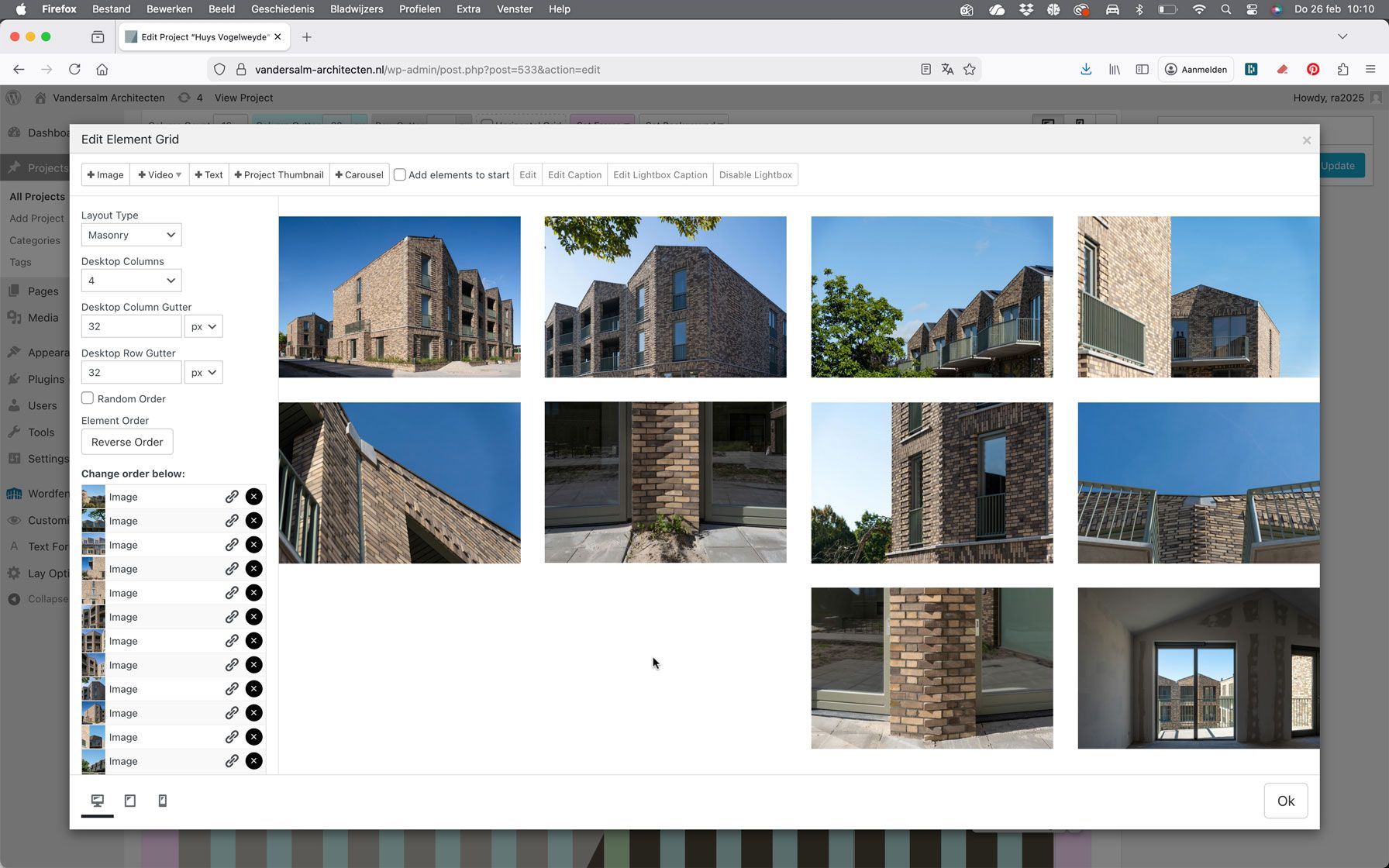
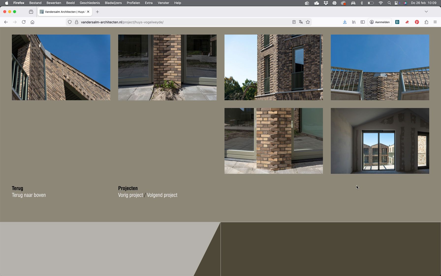
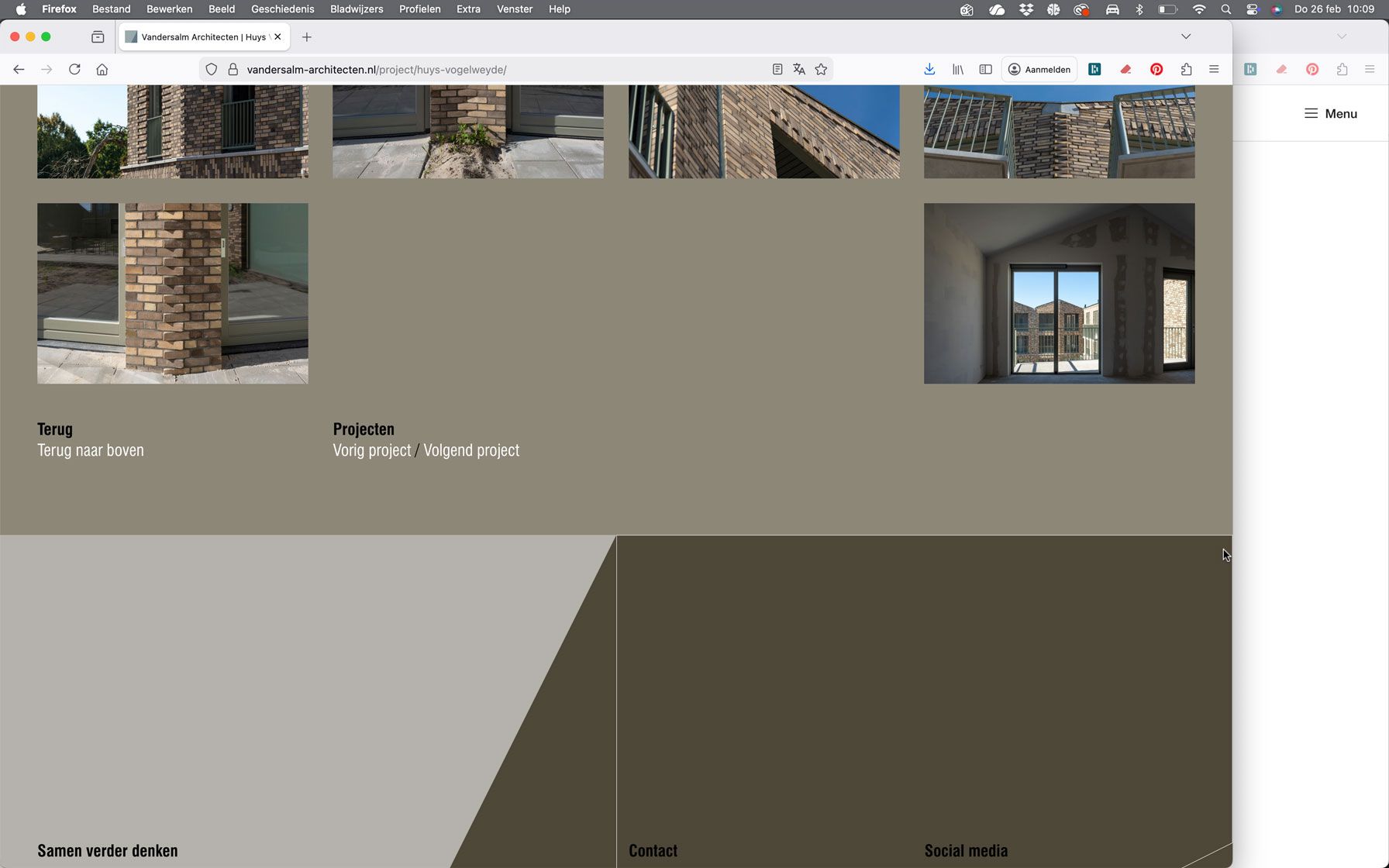
Element Grid displaying images in wrong order and misalignedSince yesterday, after duplicating a series of images on a project page on one of my client’s websites, I’ve been experiencing several issues with the “Element Grid” module.
The order of the images in the grid no longer matches the order shown in the list on the left side.
In addition, the last images are displayed with incorrect alignment. Depending on the screen size, they either align to the far right or appear randomly distributed across the four-column layout. The order of the images also seems to be changing unexpectedly.
Does anyone have an idea what might be causing this? Everything was working perfectly before, and no updates have been performed.
Here is the URL:
https://vandersalm-architecten.nl/project/huys-vogelweyde/
Some screenshots:
-
Code Snippet: make captions on carousel follow mouseNice one Armin, thanks!
-
Footer at the top instead of the bottomThanks, Armin!
The sticky footer was already enabled, but your comment about having an empty layout made me wonder if that was the issue.
And yes; after adding some test text to the layout, the footer now appears at the bottom. :)
-
Footer at the top instead of the bottomIt looks like the footer isn’t working correctly, it’s appearing at the top of my site (see link).
https://dev.rickangenent.nl/about/
I don't have the Fullscreen Slider Addon active.
-
Background color not applied in custom phone layoutYes, that would be great! Using the same background color as the desktop layout definitely makes sense.
-
Footer Row Background Color Not Visible on Mobile (Still in Inspector)Great! It works now. Thanks Armin. Really appreciate the quick help.
-
Can Text Alignment Be Set Separately for Mobile Layouts?I’ve noticed that while I can freely adjust the layout (like changing the order of elements or adding different content) between desktop and phone views, typographic adjustments like text alignment (e.g., align left or right) stay synced between both views.
It would be really helpful if alignment settings could also be set independently for mobile, just like layout changes. Is this something that’s possible or planned for future updates?
Thanks in advance!
-
Footer Row Background Color Not Visible on Mobile (Still in Inspector)No, what you're seeing is the page's background color, not the Row's. The Row has a slightly darker tint – you can see this more clearly in action on desktop.