Amazing, thank you so much!
I didn't even need to enable this function, worked straight after updating.
Amazing, thank you so much!
I didn't even need to enable this function, worked straight after updating.
Hi there,
as soon as I updated
I experienced some issues with my custom cursors for either my Frontpage or projects.
Carousel + Lightbox: Custom Mouse Cursor "Previous" and "Next" not working anymore even if set correctly in Lay Options > Carousel/Lightbox Addon
Custom Mouse Cursor Hover for Hyperlinks not showing up (everything else like filter, color and transition works) even if written correctly in custom Desktop CSS via
._luisMenu a:hover,
._aboutBio a:hover,
._aboutReferences a:hover,
._worksMenu a:hover,
._contactMenu a:hover,
._contactLinks a:hover,
._legalHeadline a:hover {
    filter: blur(2.5px);
    color: var(--custom-red);
    cursor: url(https://luiskueffner.com/wp-content/uploads/2024/10/cursorHover.svg) var(--cursor-x) var(--cursor-y), auto !important;
    transition: filter 0.5s ease, color 0.5s ease;
}
.lightbox-css-on .grid-inner .col img,
#lightbox-region #lightbox-inner {
    cursor: url(https://luiskueffner.com/wp-content/uploads/2024/10/cursorHover.svg) var(--cursor-x) var(--cursor-y), auto !important;
}
Thank you very much for your support, I really cannot explain this behavior and couldn't trace the error myself.
@user-4-33 Ah I see, it – it's the anchor that's still there...
@arminunruh
Many thanks for that, Armin! =))
It works nicely on Desktop, but on mobile it did not work on either Firefox, Chrome or Safari...
What could be the issue?
@KW1
Maybe try to assign your main bg color for the whole gridder via the gui, then create an amount of horizontally aligned stacks for each row, just like a table. Assign each stack with different ids before writing sth like:
#row3column1 {
   background-color: white;
}
This is just a guess, did not try it, but from logic perspective this should work...
On this page, the anchor for the (contact) menu does not scroll to the correct position. It only scrolls a little bit, so I would need to click multiple times to achieve accurate scrolling.
The (contact) menu is the first row of a footer, present on each page. This first row has a text element linking to #contact as well as it is sticky and straight visible at initial visit. Because of this, the element with the #contact ID itself is in the row below which was the cause of an earlier issue of the same kind.
It was working correctly previously when I did not write this contact section as a footer. So I think it has sth to do with the footer architecture since, for example, the (works) menu has expected behaviour....
Thanks for your quick response! =)
Okay, will remember that and replace these values – but does this actually come into play for the bottom value of #footer-region?
Setting bottom = 0 inside of .row4descriptionMenu did not help since this menu (description) should be placed "on top" of (contact) like on the front page...
I also tried debugging without the 5% bottom frame and just using bottom: -22vh which also was not successful. So my guess is that there must be sth else...
I have the feeling that the footer-region shifts positions in some hidden way? Since the logic itself should be correct, is it?
Hey there,
I want the first row of my footer page (which is in total less high than the full viewport) to be sticky at initial project page visit.
My footer page is structured like this
.footerMenucalc(
var(--line-strokewidth) +
var(--menu-top-padding) +
var(--menu-font-size) +
var(--menu-bottom-padding)
)
where
:root {
    --line-strokewidth: 3px;
    --menu-top-padding: 0.29vw;
    --menu-font-size: 2.63vw;
    --menu-bottom-padding: 0.29vw;
}
Row 2 with class .footerContent and custom row height of 22vh
Bottom frame: 5% via LayTheme GUI
When writing
#footer-region {
    position: sticky;
    /* negative sum of custom height of row 2 + 5 % bottom frame */
    bottom: calc(-1 * (22vh + 5vh));
    width: 100%;
    z-index: 9;
}
the position of the (contact) menu is still too high. It should be like on the frontpage where I did not use the footer, where it's still hardcoded.
It also makes no difference when I turn off or on “Sticky Footer – Will position footer at bottom when content is smaller than browser-height” via LayOptions → Footers.
I would be thankful for any help since I don't know how to proceed after various numerous tries... :'-)
Firefox, Laytheme 9.7.9.
@arminunruh I tried to add my code piece by piece and as far as I could see, it is always about the height value of
.elements-collection-region.same-height img {
    height: 70vh !important;
    width: auto !important;
}
in combination with the padding-bottom you posted in the screenshot. This padding is added via right-clicking the element grid and giving it a 5% value for "Space Below". I removed those 5% and tried the calculation you suggested. Since it is 2 times the menu bar, this is:
height: calc(100vh - (2 * (var(--menu-top-padding) + var(--menu-font-size) + var(--menu-bottom-padding) + var(--line-strokewidth)))) !important;
I also tried:
height: calc(100vh - 328px) !important;
Unfortunately, both didn't help. (The padding-bottom property of the .type-element was also not the right choice... )
I would be truly thankful if you could still try to help me with this problem. Your support is very much appreciated...
All the best
I did use your code for sure! But still got this fitting problem...
The top statement is actually
.row3impressions {
    padding-top: calc(var(--row-top-padding) * 2);
    padding-bottom: calc(var(--row-bottom-padding) * 2);
    position: sticky;
    top: calc(2 * (var(--menu-top-padding) + var(--menu-font-size) + var(--menu-bottom-padding) + var(--line-strokewidth)));
    width: 100%;
    z-index: 0;
}
while my global variables are as follows:
:root {
    --menu-top-padding: 0.29vw;
    --menu-bottom-padding: 0.29vw;
    --menu-font-size: 2.63vw;
    --row-top-padding: 0.6vh;
    --row-bottom-padding: 0.6vh;
    --line-strokewidth: 3px;
}
I write it like this because the sum of the top values are equal to the two menu bars I placed there (namely (Erinnerungsservice) and (impressions). With this, it is way easier to tweak the parameters which are on multiple project sites.
Also, sorry for not posting a link, should have done that before. Here it is! Pw is laytheme
Thank you for your help, appreciate it!
Is there a way to make the background blurry when a picture is displayed within a lightbox?
I tried to achieve this without success by clearing the background color under Lay Options > Lightbox Addon > Style and writing:
.lightbox-bg {
    background-color: transparent !important;
    filter: blur(20px);
}
What could I be missing?
Thank you as always!!
@arminunruh Thank you – looking forward!
I tried around but this did not seem to work. I could only display text but not the embedding itself...
@arminunruh Thank you, that worked well!
The only problem left is, that the top and bottom padding between the images seems to behave different on different screen sizes:
On this screen size, the bottom padding is equal to the top one.
But here, the bottom padding is smaller than the one on the top.
I got some custom top and bottom padding for the row itself with:
.row3impressions {
    padding-top: calc(0.6vh * 2);
    padding-bottom: calc(0.6vh * 2);
    position: sticky;
    top: calc(2 * (0.29vw + 2.63vw + 0.29vw + 3px));
    width: 100%;
    z-index: 0;
}
The (description) and (contact) menu are both sticky with a bottom property.
Any guess how I could approach this?
Thanks and all best
@marcos Yeah, it really seems like that lol
Sure, it is about ratio – the issue with that is, when I reduce the width by keeping the original ratio, I am unable to place it exactly between the menu bars as in my first screenshot.
Your suggestion does look like this:
So it is always missing the ideal spot. It also needs to be responsively aligned in the horizontal middle on all desktop/table screen sizes.
I'm sure I'm just missing a super simple thing...
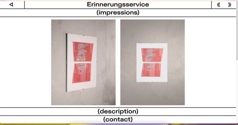
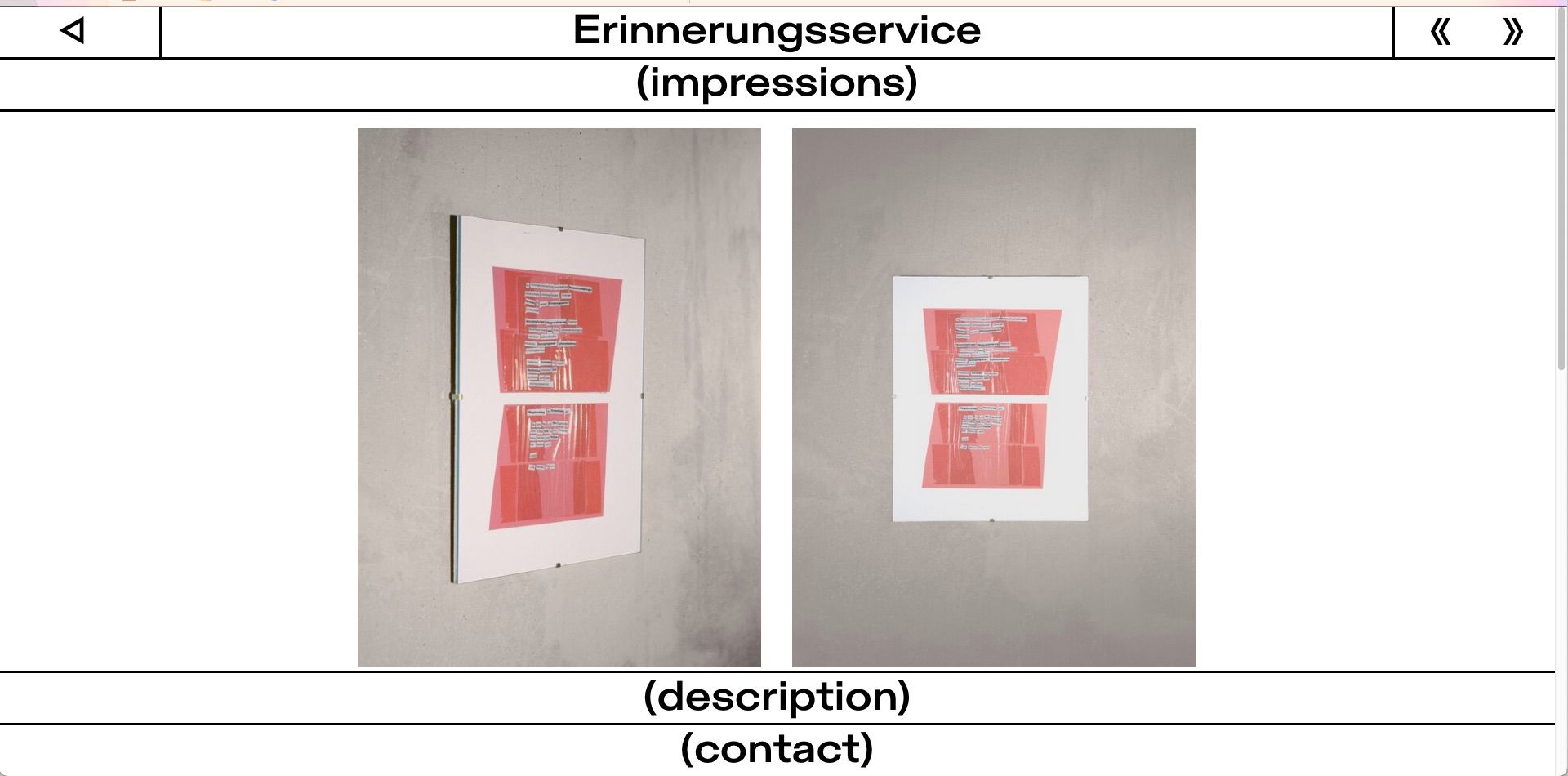
Hey there,
I am stuck with the alignment of some pictures inside an element grid which is within a row, I gave a custom row height of 70vh.
I want the pictures to be aligned like this:
Which is achieved with custom HTML input inside the gridder...
<div class="erinnerungsContainer">
    <img id="erinnerungsPic1" src="https://luiskueffner.com/wp-content/uploads/2024/09/erinnerungsservice1.jpeg">
    <img id="erinnerungsPic2" src="https://luiskueffner.com/wp-content/uploads/2024/09/erinnerungsservice2.jpeg">
</div>
... and this corresponding CSS:
.erinnerungsContainer {
    display: flex;
    justify-content: center;
    height: 70vh;
    align-items: center;
    overflow: hidden;
    gap: 20px;
}

.erinnerungsContainer img {
    height: 100%;
    width: auto;
    object-fit: contain;
}
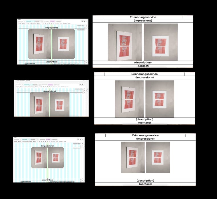
... so the corresponding gridder looks like this:
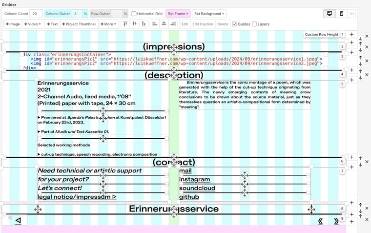
But currently it looks like this...
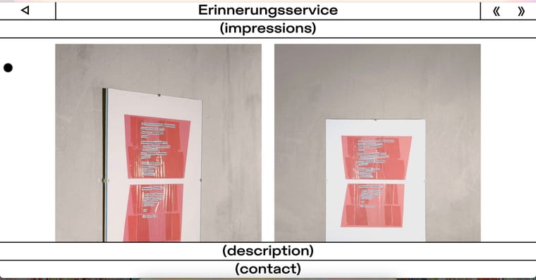
...where the corresponding gridder without custom HTML input but the two pictures inside an element grid looks like the follwing screenshot. I assigend the third row a custom row height of 70vh. If needed, I also provided the custom class names, which are currently without any custom CSS.
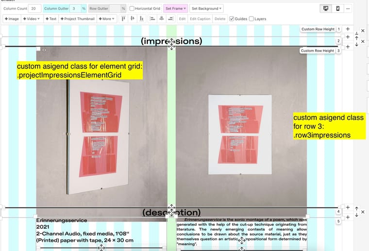
I would be very thankful if someone could advise me on how to achieve my desired alignment by using Laytheme elements like the existing element grid or even the simple placement of single pictures (in combination with custom CSS if needed)...
Thank you all in advance!
Hey there,
I would love to add a SoundCloud embedding into my element grid which I've done before with custom HTML inside the gridder. But since there is no option for that inside of element grids, I propose this as a feature.
Or is there any possible workaround for that?
Thanks and have a nice day!
Did not work either :-(
No pictures are shown at all.
I also tried it with a new blank page and removed the swarmContainer class.
I did exact this but unfortunately it did not work... What could be missing?
I could not manage to align normal image inserts the way I wanted with custom ids and css, so I tried to insert the images with pure html and it worked...
Hi,
how can I trigger the Lightbox plugin to present images, that were inserted manually in the gridder with custom HTML? Here is the corresponding webpage.
<div class="swarmContainer">
    <img id="swarmPic1" src="link/to/image1.jpg">
    <img id="swarmPic2" src="link/to/image2.jpg">
</div>
Thank you very much and have a nice weekend!
Because I run into trouble with vertical scroll on this page...
... and it gives possibility for interaction when autoplay is not desired.
Do you think a custom solution with JavaScript etc. would be possible?