Carousel "X"
-
Tested on:
Firefox 154.0.1
Safari 26.6
Brave 1.93.138 (Chromium: 151.0.7922.173)HOMEPAGE
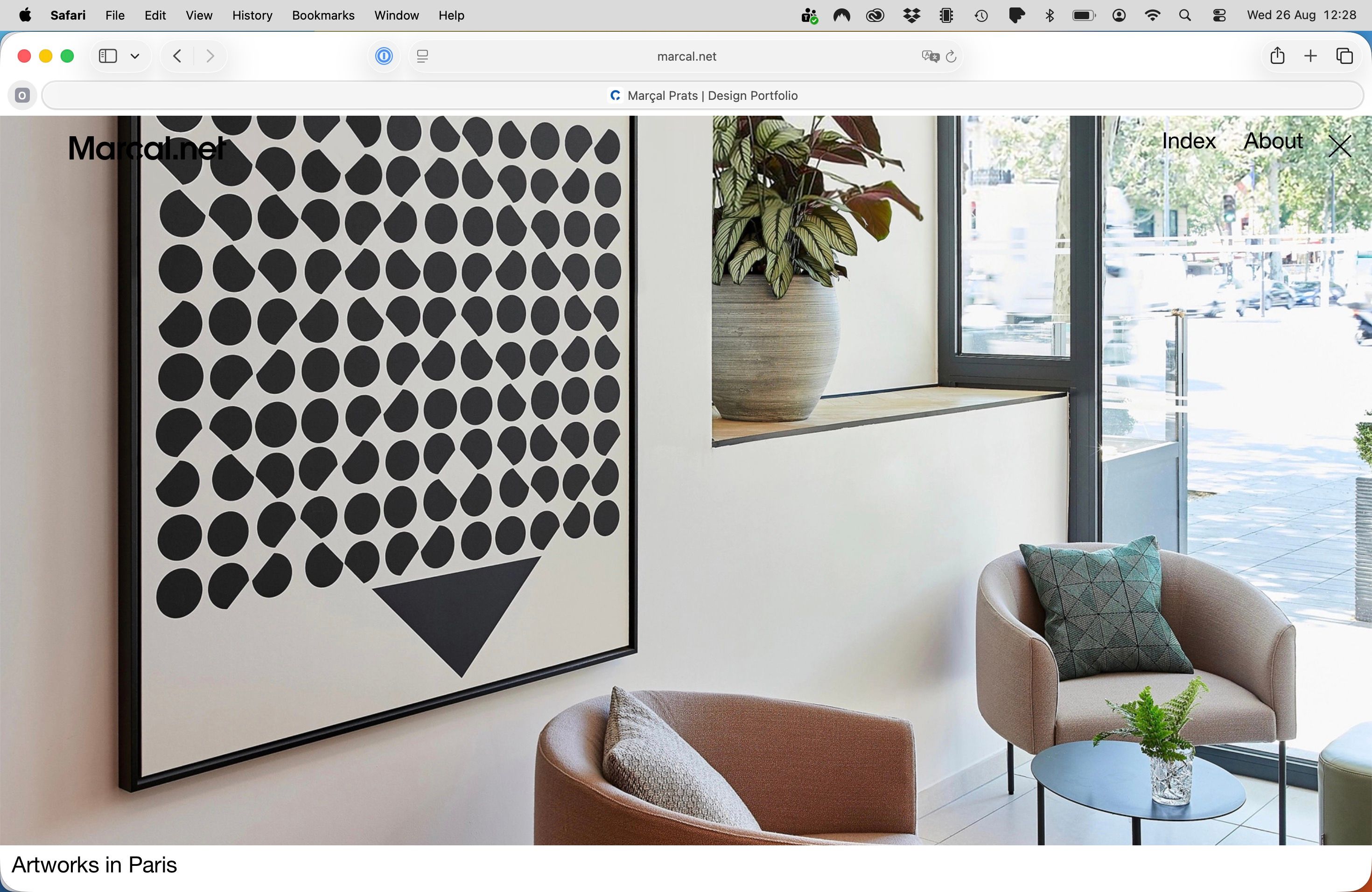
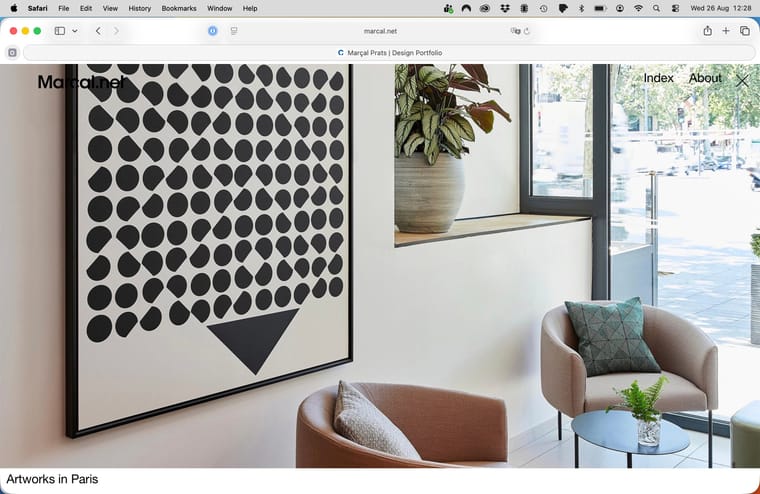
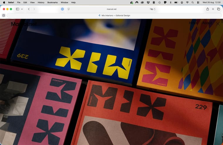
My portfolio website relies heavily on carousels. The home page has a full-screen carousel at the top. The first issue is that the close "X " icon appears on the right side of the "About" menu:
www.marcal.netWhen scrolling down to see the other project carousels, the top "X" icon disappears.
My first question is whether it would be possible to disable the "X" icon when loading the homepage. Same issue in mobile browsers / iPhone.
PROJECT CAROUSELS
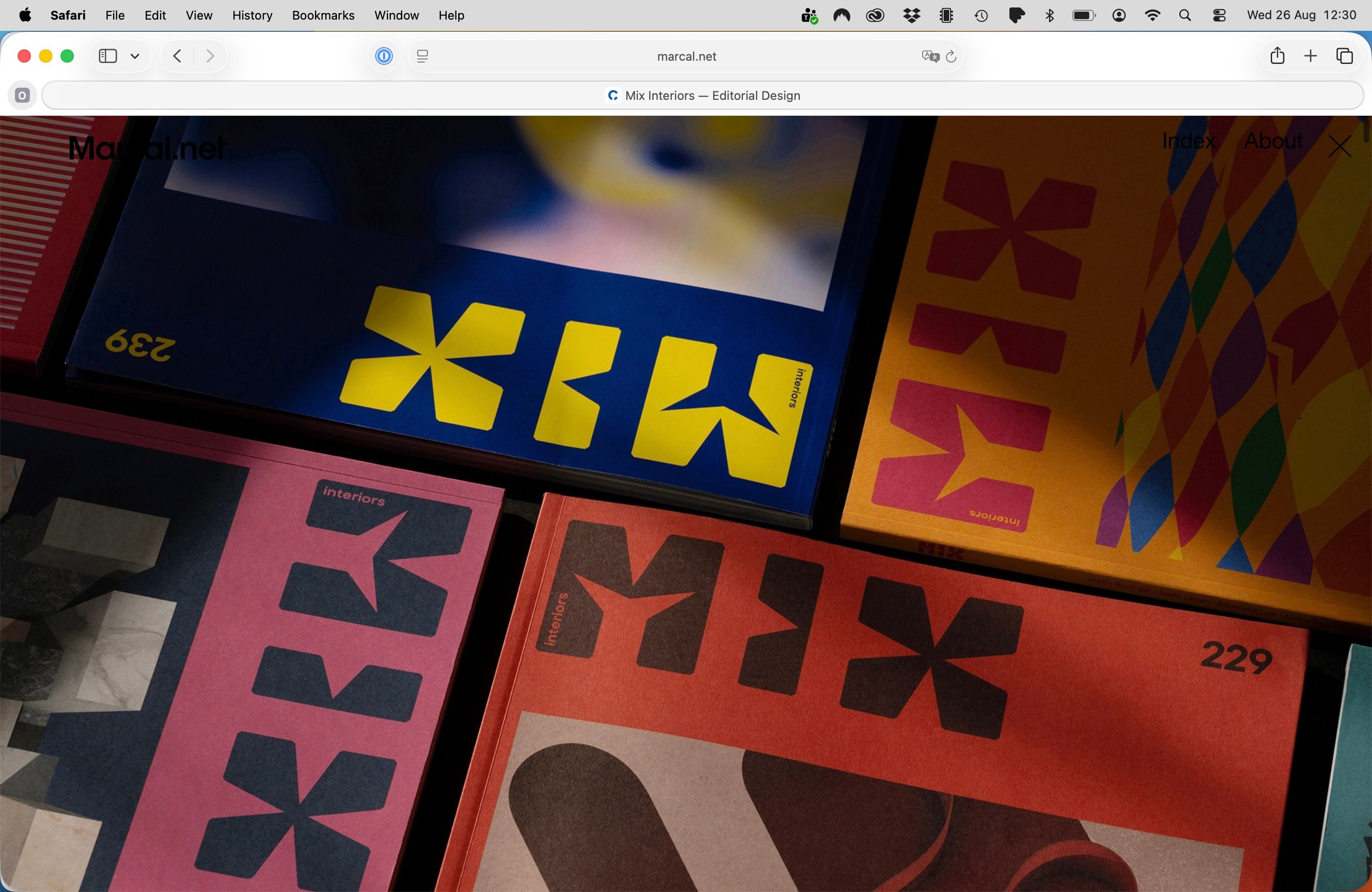
Another topic is, for example, when I click on any of the home page carousels below, it loads the project with the option to close the project by clicking the "X" icon at the top again. This is good, as closing the project makes the homepage visible again.
https://www.marcal.net/mix-interiors-editorial/
The issue is whether it would be possible to have the "X" icon aligned vertically with the menu "Index About X".
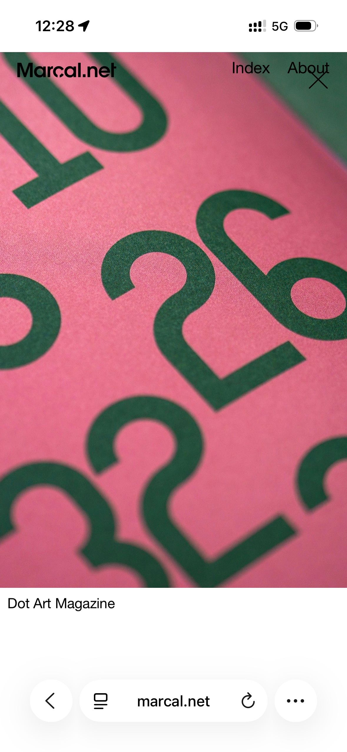
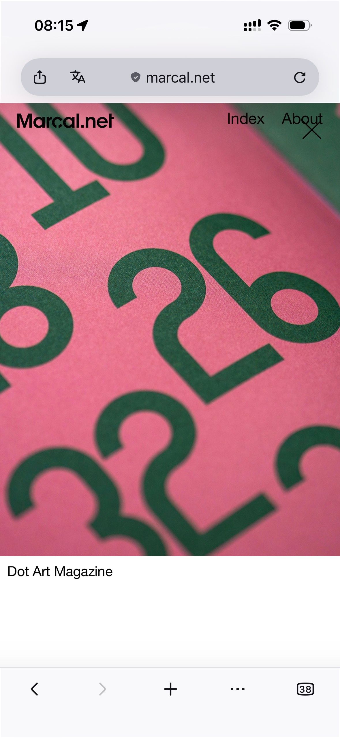
The issue is worse on mobile, where the "X" icon is placed disaligned over the "About" (tested in iPhone Pro 15). (Screenshot attached below)
Moreover if there are other option to place the "X" icon in other places, for example, leave the menu only to "Index About" and then place the "X" icon right below.
NEGATIVE CONTRAST
Last question related to the "X" icon, and for extension the whole website logo, menu and "X" icon.
Some projects on my website have a white background, others have a black background, and others have a colour background. The issue is that when any project has a black background, the website logo, menu, and "X" icon logically disappear, only to become visible when an image scrolls down underneath. (Screenshot attached below)
Black background example:
https://www.marcal.net/mix-interiors-editorial/White background example:
https://www.marcal.net/artwork-catalogue/My last question is: is there any way for mainly the "X" icon, and if possible, for the website logo and the menu to have a negative overlay effect, so that it is always in the negative colour of anything it has underneath.
Many thanks,
Marçal
-
Hey Marçal, please update Lay Theme.
I think you have an older version which may have this bug.
At least that's about the X icon.
Also, did you read the text that is shown before posting a bug? It says to try and update Lay Theme and all the Lay Theme plugins, and try to disable external plugins and see if that solves it.
-
so the x that is shown inside of the project is the x that belongs to the project overlays. This is the correct x.
About the side title and the menu contrasting, I would suggest you go to the customizer and enable mix blend mode difference for both of them.
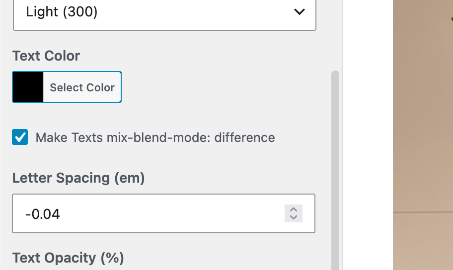
I think images don't really have a mixed blend mode difference. Logo images don't really support that. You may need to write custom CSS to make that happen for your logo image site title.
Or you can use a menu bar with a lighter color, which you can also enable and customize - menu style.
-
About the X icon of project overlay positioning on phones:
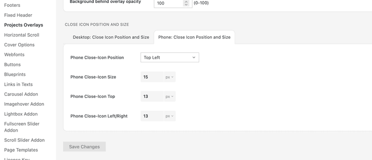
I mean, there are settings for the phone X icon. Maybe you didn't see them?
-
The issue is whether it would be possible to have the "X" icon aligned vertically with the menu "Index About X".
Yeah, that's a good question. You could theoretically move the menu so it has more space to the right and then position the X icon just in that place. It's all possible with the menu positioning settings in the customizer and the position and size settings for the X close icon shown in the screenshot above.
-
I'm going to work on the site title being able to have a mixed blend mode difference, too. With the next update, you're going to be able to have your site title work like that, so you won't have to write custom CSS
-
and for the X icon i will code this too <3
-
Hi Armin,
I'm so sorry for not having the Lay Theme updated to the latest version when I wrote this post. I usually receive a message from my WordPress asking to update, but it didn't work this time.
I have updated everything. It resolved the initial "X" icon on the desktop home page, but the issue persists on mobile—emptied the cache before testing. (Screenshot attached)
I will follow your advice and suggestion to adjust the menu position to align with the "X" icon.
One workaround I did in the past was to add an image to the top of the project for the menu to be visible, but I personally don't like how it looks:
https://www.marcal.net/river-rights/The difference in mixed blend modes is an amazing feature! I'm going to use it. And I'm very grateful that you're going to add this feature to the site title as well. 🎊
Many thanks for everything.
-
Thanks! The remaining X is the search close icon. Your updated Lay Theme CSS already contains the fix, but WP Fastest Cache is still serving an older minified CSS file. Please use “Delete Cache and Minified CSS” in WP Fastest Cache, then reload the page. Clearing only the browser cache is not enough.
-
-
aha thanks a lot!! <3 :))
-
-
Hi Armin!
Good news! My site logo now has the same mix-blend-mode: difference effect 🎊
I had to change the black logo SVG to a white one so this would work.Anyway, I also have this custom CSS that does the job, even without the feature activated:
a.sitetitle,
a.sitetitle.is-fixed {
mix-blend-mode: difference;
background: transparent;
isolation: auto;
}a.sitetitle img {
mix-blend-mode: normal;
}
Screenshot attached.

-
Last thing: now the carousel "X" icon does not appear when landing on the home screen (good!), but it also does not appear when visiting any of the project links on the home page.
However, the "X" icon is still functional, so clicking on the "X" icon area when visiting a project closes it and returns to the home page.
Is it possible to have the "X" icon feature back, only when visiting any of the homepage project links?
Then I would add the following CSS to apply the mix-blend-mode: difference effect to the "X" icon.
div.close-projects-overlay {
mix-blend-mode: difference;
background-color: transparent;
isolation: auto;
}
Many thanks!
-
Hey, you need to set up the icon to be white, cuz that's what mix blend mode difference needs to work correctly.
-
div.close-projects-overlay {
color: #fff !important;
mix-blend-mode: difference;
background-color: transparent;
isolation: auto;
}You can also try this CSS. <3
-
-
-
Hello! It looks like you're interested in this conversation, but you don't have an account yet.
Getting fed up of having to scroll through the same posts each visit? When you register for an account, you'll always come back to exactly where you were before, and choose to be notified of new replies (either via email, or push notification). You'll also be able to save bookmarks and upvote posts to show your appreciation to other community members.
With your input, this post could be even better 💗
Register Login