Mobile (smartphone) "use desktop menu for mobile" changes the orientation of my menu
Bug Reports
2
Posts
2
Posters
379
Views
1
Watching
-
Hi,
I'm excited to have the option to use my desktop menu navigation for my mobile site, however when I apply the feature, it seems to change the orientation of my menu... for example, it puts my 'about' menu on the right and 'index' on the left... Also, I'm wondering if there is a way to adjust the space between the menus on mobile? Any help would be great. Thank you!
-
Oh, can you send the URL please?
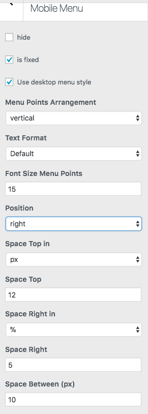
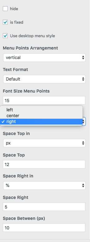
Afaik you can only set the menu position to "left" "center" or "right"

Forgot your key, lost your files, need a previous Lay Theme or Addon version?
Go to www.laykeymanager.com