Mobile (smartphone) "use desktop menu for mobile" changes the orientation of my menu
-
Hi,
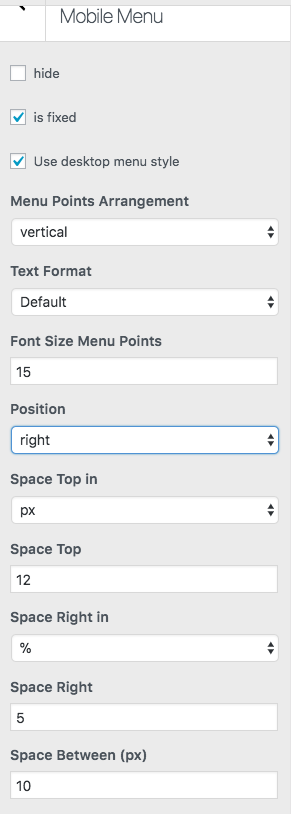
I'm excited to have the option to use my desktop menu navigation for my mobile site, however when I apply the feature, it seems to change the orientation of my menu... for example, it puts my 'about' menu on the right and 'index' on the left... Also, I'm wondering if there is a way to adjust the space between the menus on mobile? Any help would be great. Thank you!
-
Oh, can you send the URL please?
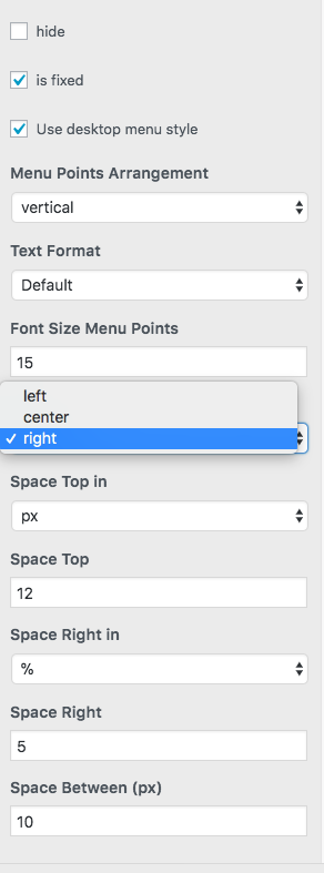
Afaik you can only set the menu position to "left" "center" or "right"

Hello! It looks like you're interested in this conversation, but you don't have an account yet.
Getting fed up of having to scroll through the same posts each visit? When you register for an account, you'll always come back to exactly where you were before, and choose to be notified of new replies (either via email, or push notification). You'll also be able to save bookmarks and upvote posts to show your appreciation to other community members.
With your input, this post could be even better 💗
Register Login