the next update will include more sorting settings even for show all projects
 A
A
arminunruh
@arminunruh
Posts
-
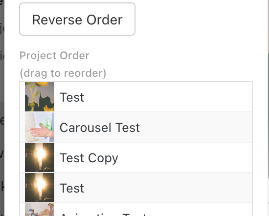
In Edit Project Thumbnail Grid the Order section the functionality does not work -
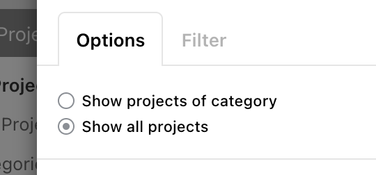
In Edit Project Thumbnail Grid the Order section the functionality does not workwait actually i think its not a bug, its just how it works if you check "show all projects":
-
SMOOTH SCROLL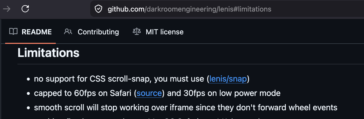
Seems like a limitation of the smooth scroll library I'm using.
next update will include a little hack so the scrolling will be better on iframes. -
page overlay menu after update 11.1.8i see.
if u want you can send me your login info: to info@laytheme.com
Send your website address, WordPress admin username and password, and link to this topic.Also, please maybe describe with some screenshots and some text the different issues if they are not easily describable or easily seeable.
I will copy your site over to my macbook so i dont touch your live site and then i will investigate there
-
In Edit Project Thumbnail Grid the Order section the functionality does not workah its an issue where i dont invalidate the layout cache correctly. will be fixed with the next update
-
In Edit Project Thumbnail Grid the Order section the functionality does not workah i see. this normal one right:
-
In Edit Project Thumbnail Grid the Order section the functionality does not workhello which order are u choosing, do u have a screenshot?
there are many different ways of ordering -
Project Overlay + Carousel / Lightbox issue on direct URL loadthank you im happy that it works!!
yes sometimes i do support every day or every other day,
but sometimes it can take a week or more when im super busy with coding new lay theme features and working on client projects. i always feel bad about letting people wait that long :O but im glad it wasnt urgent in your casehave a nice day
-
Problem after update 11.1.8thanks!
so i investigated this and i found out that some of the positions would be different after the update. so i did a fix so the page overlay positions should be back to were they were before.
the new page overlay settings have position settings now.
the default positions lay theme chose were wrong ones before
-
Can’t add footer with full screen sliderin lay options -> fullscreen slider addon
-
Can’t add footer with full screen slidernext update will include this new setting!
-
Scroll on hover for mobile images not sizing consistentlyabout the other issue, do you see how the images are being sized?
In Lay Options - image hover add-on
You actually only size max width and max height.
Do you mean that portrait images have a different width than landscape images?
Or do you mean actually the same image gets a different size when you refresh or come back to the page? -
Scroll on hover for mobile images not sizing consistentlySo about this one issue:
The timing of when the image appears on scroll is controlled by a setting in Lay Options → Imagehover → Scroll Trigger Y (Phone) (and there's a separate one for Desktop).
This value is the Y-position (in pixels, measured from the top of the viewport) at which a link's text needs to be in order to trigger its hover image. So if it's set to, say, 500px, the image only shows once the link's text has scrolled up to within 500px of the top of the screen.
If you want the image to appear earlier (e.g. as soon as the top project is in view), set this to a higher value — try something close to your viewport height (e.g. 700 or 900). If you want it to appear later, lower the value.
Try a few values and see what feels right for your layout.
-
Blurry custom cursors in Safari – Any way to get vector-sharp quality?okay, so I actually can't reproduce this.
Can you make sure to update to the latest version of Lay Theme, and if that doesn't fix it, can you send me your website address, WordPress admin panel login (meaning username and password), and a link to this topic to info@laytheme.com? -
fixed height for text elements px, % or vhhey there, quick hats up. I removed this section in the row side bar.
And now it works differently. Now in a row, you can just resize the elements up or down to trigger their stretch.
So just go with the mouse to the bottom or the top border of the element and then resize it up or down. I was thinking this is more elegant.
-
Scroll on hover for mobile images not sizing consistentlysorry, I haven't gotten around yet to fixing this.
-
Specific image hover size and positionhey, so the project index element now has image hover settings too in its modal.
-
Blurry custom cursors in Safari – Any way to get vector-sharp quality?Hey so I guess this problem still persists, right?
I haven't found the time yet to fix this. -
handling of changes in mobile menu layouts within updatesYou too. Yes, of course it's a very good remark that you made.!