Thanks Armin! This fixed my issue!
Nzagamba
Posts
-
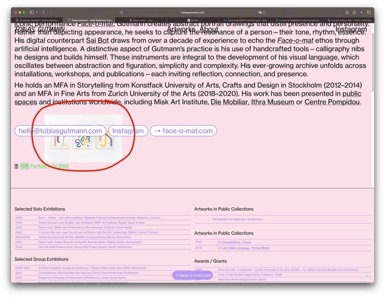
hover image of link shows under buttons - zindex issue -
hover image of link shows under buttons - zindex issueI noticed hover images of my links show under the button links, is this just me, or is this a general issue? Couldn't figure out, which z-index rule is causing the problem.
I tested in Safari on mac desktop.
link to website
-
vimeo embedded in element grid - slow on mobile and scroll issueThanks Armin for your Help with the js script. My site now works with Laytheme-caching.
Regarding video embed, I tried everything:- mp4 embeds with laytheme brought other issues, since I had a lot of autoplay videos: Once umuted, the video just continued to play, even if I started a second video. ended up in chaos.
- hls direct links worked for a few videos, but not for 20 videos on the same page. Loading so many videos was an issue.
- Finally I came to the conclusion, simple vimeo iframe embed is still the most robust. I just had to remove autoplay, because that made it lag a lot on mobile.
Maybe in future, I find a better way, but for now I keep it simple with vimeo embeds.
But Thanks a lot for your help!
-
vimeo embedded in element grid - slow on mobile and scroll issue@arminunruh said in vimeo embedded in element grid - slow on mobile and scroll issue:
Does this also work with Cloudflare Stream, which also provides HSL direct video links for streaming? Vimeo Pro is extremely expensive and I only have vimeo plus?
should work yea
if not let me know i can probably make it workI'm back with a hls video direct link test (first videos are hls, towards the end a few videos are still vimeo iframe embeds)
- I used cloudflare to upload videos and create hls direct video links.
- I used laythemes video embed toll mp4 direct link. autoplay /muted.
- I added plyr.io to style my player
- I added a lot of js and css (thank you ChatGPT and Gemini), to style it and make it work.
On desktop it works quite smoothly, but on mobile (I use iPhone safari) I've had a hard time getting it to work smoothley.
Bugs noticed:
-
on mobile, the video starts playing, but sometimes when I pause and start again, it stops, gets stuck in endless loading, this also sometimes happens when scrolling away and scrolling back to the video.
-
fullscreen on mobile is a pain, it just doesn't display properly and also it sometimes stops and gets stuck loading. Do I really have to design this myself with even more custom code, or is there a standard that just works fullscreen and is responsive also to landscape mode?
-
when internet connection is not super fast, the video plays in very poor quality. this is probably due to hls compression, but on vim iframe it never shows that poor quality. anything I can do?
I think I got quite far with my tests, after sleepless nights of trial and error, but still it is quite fragile, especially on mobile using hls direct links. Any advice out there to make it work smoothly on mobile?
-
vimeo embedded in element grid - slow on mobile and scroll issueSo, in my case, when I turn on Laytheme's Chaching, the filter menu, does not hide when scrolling down, and the toggle button shows on all pages, always, instead of just the two pages with the filtermenu.
Currently I turned off lay themes caching and use the plugin "wp fastest cache"
Here's my CSS code:/* Filter Buttons hide when scrolling down on Desktop */ .mystickyrow { position: sticky; top: 0; z-index: 999; transition: transform 0.45s ease; will-change: transform; } /* slide up */ .mystickyrow.hide { transform: translateY(-120%); } /* Mini Toggle Button */ #filterToggle { position: fixed; top: 60px; left: 50%; transform: translateX(-50%); /* adjust for element width */ width: 45px; height: 45px; border-radius: 25px; background: #9574ff; z-index: 9999; cursor: pointer; opacity: 0; pointer-events: none; transition: opacity 0.25s ease; } #filterToggle.show { opacity: 1; pointer-events: auto; }And here's my js:
<!-- Desktop Filter Menu Logic --> <script type="text/javascript"> (function() { let lastScrollTop = 0, isAutoScrolling = false, autoScrollTimeout = null; let toggleBtn = null, scrollHandler = null; function destroy() { if (toggleBtn) toggleBtn.remove(); if (scrollHandler) window.removeEventListener('scroll', scrollHandler); lastScrollTop = isAutoScrolling = autoScrollTimeout = toggleBtn = scrollHandler = null; } function init() { const filterBar = document.querySelector('.mystickyrow'); if (!filterBar || window.innerWidth < 600) { destroy(); return; } destroy(); lastScrollTop = window.scrollY; // create toggle button toggleBtn = document.createElement('div'); toggleBtn.id = 'filterToggle'; document.body.appendChild(toggleBtn); const show = () => { filterBar.classList.remove('hide'); toggleBtn.classList.remove('show'); }; const hide = () => { filterBar.classList.add('hide'); toggleBtn.classList.add('show'); }; toggleBtn.addEventListener('click', show); toggleBtn.addEventListener('mouseenter', show); // scroll behaviour scrollHandler = () => { const st = window.scrollY; if (isAutoScrolling) { clearTimeout(autoScrollTimeout); autoScrollTimeout = setTimeout(() => isAutoScrolling = false, 100); lastScrollTop = st; return; } if (st > lastScrollTop + 10) hide(); else if (st < lastScrollTop - 5) show(); lastScrollTop = st; }; window.addEventListener('scroll', scrollHandler); // hide on filter link click filterBar.querySelectorAll('a').forEach(link => { link.addEventListener('click', () => { hide(); if (link.hash) isAutoScrolling = true; }); }); } document.addEventListener('DOMContentLoaded', init); document.addEventListener('laythemeAjaxContentLoaded', init); })(); </script> -
Anchor scroll position, relative to filterbutton div heightthanks for your replies!
-
I found a different solution, hiding menu when scrolling to anchor point.
-
That is strange. Also sometimes the area is black and sometimes white, sometimes purple. I think it has something to do with my custom js menu, because on all other pages it works great and shows transparent. It is just when I open my filter menu on one of my pages (1 or 2) on mobile, or click an anchor link, the bottom area below url UI of Safari is covered with a color. ChatGPT thinks it's the combination of position: fixed elements and the way my custom JS toggles the filter menu on iOS Safari. But ChatGPT could give me a solution that works.
Perhaps there’s a way to handle this specifically for iOS Safari when the menu is opened or a user clicks a filter button. Any guidance or solution you could suggest would be greatly appreciated.
Thank you very much for your time and expertise!
-
-
mobile menu Style 1 - dark transparent backgroundmany thanks for this! Works great!
-
vimeo embedded in element grid - slow on mobile and scroll issueThanks Armin for your reply!
you can use those with +video -> +.mp4 video (check use external url)
Does this also work with Cloudflare Stream, which also provides HSL direct video links for streaming? Vimeo Pro is extremely expensive and I only have vimeo plus?
i think lay themes caching is probably faster
I've tested the laytheme caching plugin, but it is not compatible with my js filtermenu on desktop. Is there anything I can do, to make my filter menu work and still use the laytheme caching?
-
vimeo embedded in element grid - slow on mobile and scroll issueI just tried to play with the caching settings, and found out the following:
In Lay Options I ticked:
✅ Enable Layout Cache
-> makes first video loading very slowly, rest of the videos loads correctly.
-> my beautifully customized filter menu on desktop with js features breaks, when this is active.✅ Disable Ajax / Compatibility Mode
-> makes first video not load at all, rest of the videos loads correctly
-> my beautifully customized filter menu works now.I'm wondering now, If my site gets slower, if I don't activate caching? Should I then use a caching plugin like WP fastest cache? I can't tell if the site is faster using WP fastest cache...
and how do I get my first video to load?
PS:
scroll issue is solved after deactivating ❏ smooth scrolling -
vimeo embedded in element grid - slow on mobile and scroll issueI embed quite a few videos in my Element Grids. I use the laytheme function to add the vimeo videos.
The vimeo videos are set to autoplay, muted, and loop.
Here is my page
There are a few issues I face:Desktop:
- First video somehow loads very very slow, the videos further down work great, why is the first video not playing directly? It shows a black video for a long time, before playing.
- scroll issue: when scrolling down over a video, somehow scrolling blocks and slows down. Why? Can I turn this off?
Mobile:
- Videos on mobile don't load, or load very slowly, why is this?
Is there any way, I can improve these bugs?
-
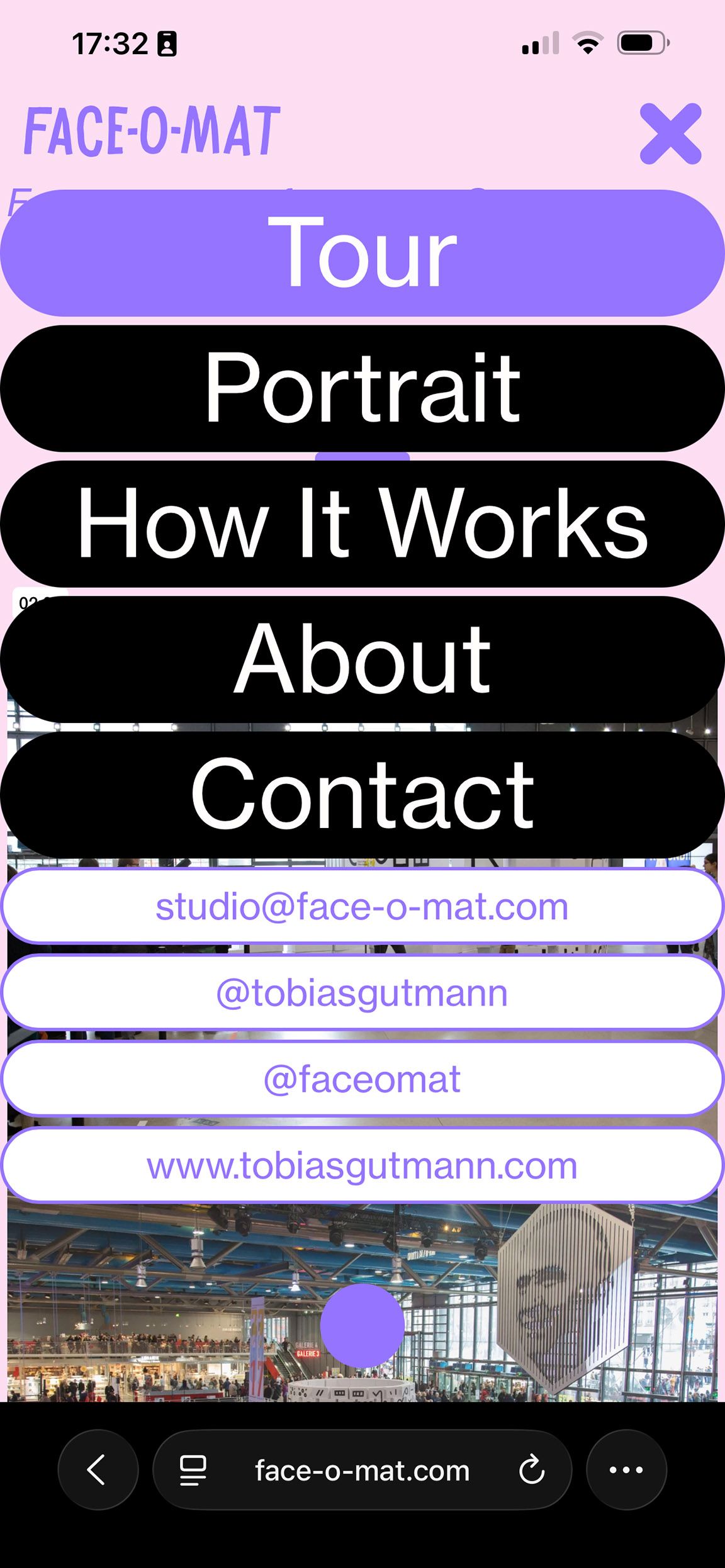
mobile menu Style 1 - dark transparent backgroundI would like to darken the background of the website, when my mobile menu style 1, drops down.
The css rule of the background could be something like the bellow, but I couldn't figure out to what class or div I need to point this css to:/* Transparent full-page overlay behind the menu */ .menu-overlay { /* what is the correct class??? */ position: fixed; inset: 0; background: rgba(0, 0, 0, 0.5); opacity: 0; transition: opacity 0.25s ease; z-index: 1000;
-
Menubar shows up on Mouseover but shouldn’tI have the same issue, and would love to have it resolved, my menu bar correctly hides, when scrolling down, but shows up, when I mouse over on the top area. it should stay away and only appear, when scrolling up. Is there a fix for this? here my site.
-
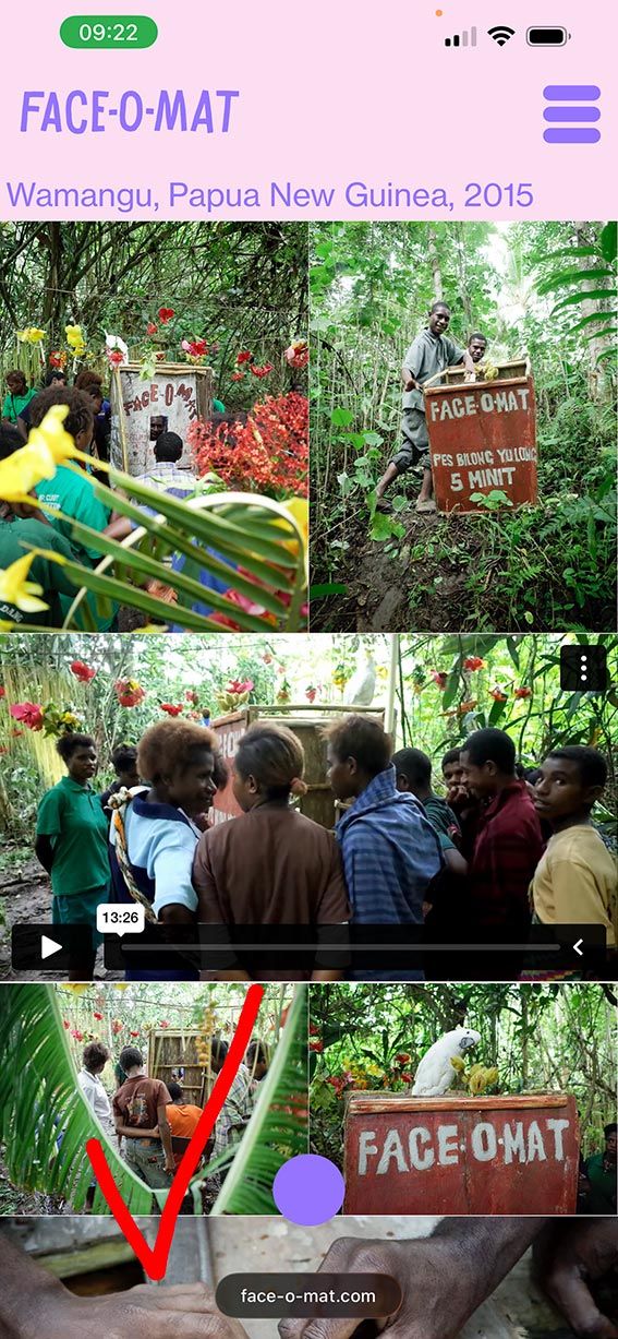
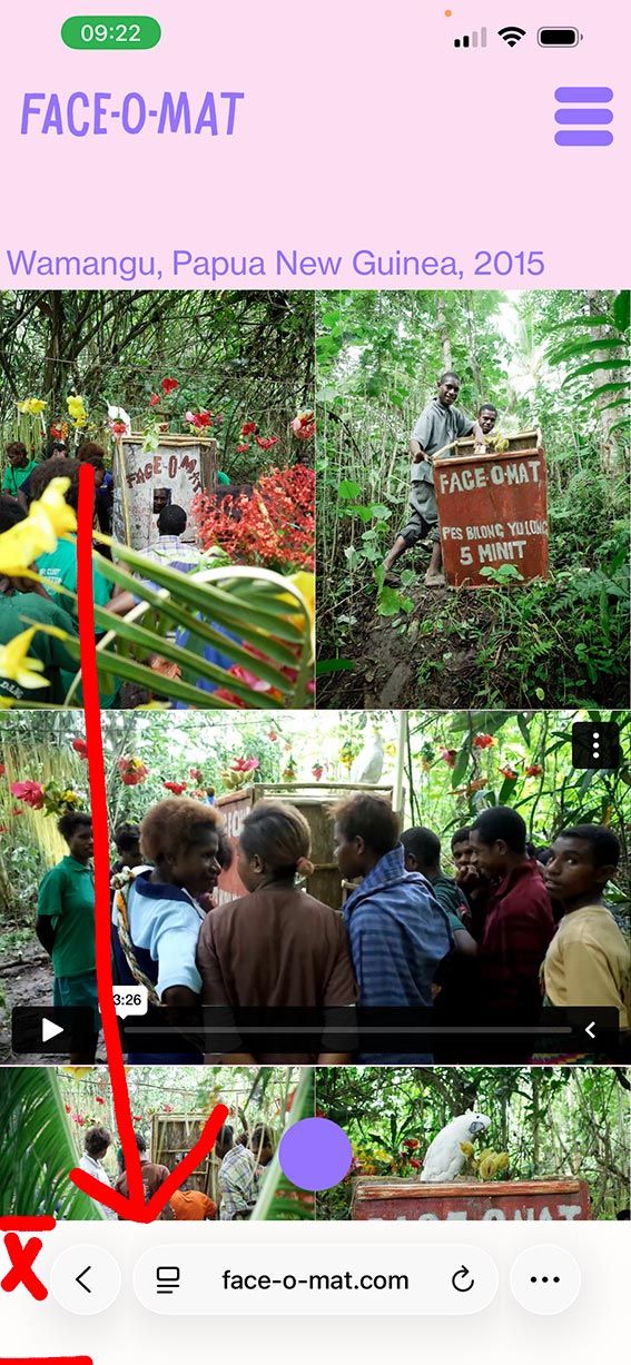
Anchor scroll position, relative to filterbutton div heightI also have a second issue, with the same filterbutton-menu from above. In mobile I used css and js to collapse the menu. For some reason, on iphone safari, once I click on one of the filter buttons, the bottom area suddenly covers in white. I spent hours with ChatGPT, trying to find the bug, but couldn't find a solution. So, here I am, I need some human help with this? :-) Could anyone look into it? Bellow images showing the correct screenshot on the left and the bug version on the right (once clicked on a filter button.


-
Anchor scroll position, relative to filterbutton div heightSituation (here is my website draft):
- I have 12+ filter buttons, position fixed on top of the website.
- the buttons have anchor links that scroll to a certain area.
Problem:
- Depending on the screen width, the div, holding the buttons has a different height, breaking into 2, 3, or 4 lines, which makes the div height increase, on smaller screens. This is a problem, because the anchor scroll position should be relative to the div height holding the buttons, it should always scroll to the bottom edge of the div holding the buttons. Now the anchor links scrolls underneath the buttons on small screens. I put a padding-top 200px on the content div, but this only works for wide screens, not when the buttons break in to 3 or 4 lines, on smaller screens.
Any suggestions or tipps on how I can solve this? I'm happy to get some help on this. Many thanks in advance!
-
change custom play iconOther question related to custom video button:
I am embedding videos in element grid here, using custom play button. I noticed an issue in chrome, that the sound is muted, even though in Laytheme I did not click the settings "mute". In safari, the sound seems to work. Also I tried to use the regular vimeo play button, and the sound also played in safari. Any tipps on how to solve this one? -
change custom play iconThanks Armin, my svg hav a size set already. and today suddently it worked, I think it was a cache issue of an old svg... glad it works now! Beautiful!
-
change custom play iconjust trying to upload my own video play icon and have the same issue with svg. I set the css to:
.lay-vimeo-playicon-custom img {
  width: 200px !important;
}
but the svg is still scaled up to the edge of the video.
with png, I could set the image to 200x200px, but then the resolution of the icon looks pixel on retina displayswhat am I missing?
-
Wish: Scroll-Driven Carousel (Locomotive-Style) & Mobile Stacked ViewThanks Armin! Looking forward this! You are amazing!
-
Wish: Scroll-Driven Carousel (Locomotive-Style) & Mobile Stacked ViewI tried to doing a test here (desktop version) to get as close to what I am looking for. kind of works on desktop version, but the scroll only functions when the cursor is on the carousel, which makes it not very user friendly, sometimes the carousel is cut off on top or bottom of the browser while scrolling horizontally. On mobile the scroll doesn’t work at all. Any tipps on how to fix this scroll behaviour?
-
Wish: Scroll-Driven Carousel (Locomotive-Style) & Mobile Stacked ViewHi LayTheme team,
I’m using the “slide” transition for my carousel and I’m wondering if a specific scroll behaviour could become a native feature.
When the user scrolls down and reaches a full-width carousel, it would be amazing if the vertical scroll could be mapped to a horizontal progression through the carousel images. After reaching the last image, the page would continue scrolling down normally again.
In other words: a vertical → horizontal → vertical scrolling experience, similar to the smooth effects seen with Locomotive Scroll.
It could even work so that the vertical scrolling continues very slowly during the horizontal movement, and then speeds up again once the carousel is finished.
I know this could be achieved with custom GSAP code, but having this as a native option in the Carousel Add-on would make it much more accessible.Second wish:
A toggle to switch the carousel to a simple stacked layout on mobile (images underneath each other). Carousels often feel clumsy on mobile, and a “stack on mobile” option would be extremely helpful.Looking forward to hearing what other think, about this idea.